


Choosing a therapist is a deeply personal decision. Someone searching for support isn’t simply comparing credentials, specialties, or treatment methods. They’re trying to get a sense of the person behind the practice, whether that person’s approach resonates with them, and whether they can imagine feeling comfortable enough to share some of the most vulnerable parts of their life.
That’s a pretty significant responsibility for a brand and website!
When Melanie Spurgeon and I began working together, she was preparing to introduce her therapy practice to the world. She knew the kind of therapist she wanted to be, the people she wanted to support, and the philosophy she wanted to bring to her work. What she needed was a way to communicate all of that to someone who hadn’t met her yet.
Our goal was to create a brand that reflected the compassion, curiosity, gentleness, and mind-body awareness at the heart of Mel’s approach to therapy. We wanted people to get a genuine sense of who she was and what working with her might feel like, while giving her a professional foundation she could confidently build her practice around.
We started with a complete brand identity and a Showit website. Three years later, we’re still working together, and that original brand continues to support everything from educational resources to email marketing and new ways of connecting with prospective clients.
And THAT is one of my favorite parts of this project.
Project Snapshot
Client: Melanie Spurgeon
Industry: Therapy & Mental Health
Location: Memphis, Tennessee
Services:
- Brand Strategy and Creative Direction
- Brand Identity Design
- Semi-Custom Showit Website Design
About Melanie Spurgeon
Melanie Spurgeon is a therapist whose work centers on helping people navigate the complicated experiences that come with being human. Her practice addresses anxiety, stress, burnout, self-doubt, shame, depression, relational trauma, grief, life transitions, women’s health concerns, and challenges with communication and boundaries.
What stood out to me during our earliest conversations was the way Mel talked about her approach to therapy.
She incorporates practices including Somatic Experiencing, EMDR, parts work and Internal Family Systems, narrative work, mindfulness, and other techniques that recognize the relationship between our thoughts, emotions, bodies, and lived experiences.
But she wasn’t simply describing a list of treatment methods. She talked about helping people become more curious about themselves, recognize what they’re experiencing without immediately judging it, and develop a greater sense of connection with their bodies and emotions.
Words like attunement, presence, gentleness, curiosity, and compassion came up repeatedly.
I could already see a very distinct personality emerging through the way she described her work, and I wanted someone encountering Melanie Spurgeon for the first time to experience that same sense of warmth and thoughtfulness.
Why Branding Matters for Therapists
Therapy is an interesting industry to design for because the person providing the service is such an important part of the service itself.
Someone might be researching therapists because they’re navigating a difficult relationship, struggling with anxiety, grieving a loss, or trying to understand experiences they’ve carried for years. They’re considering whether to sit across from another person and share things they may have never spoken about openly.
Of course, professional qualifications, specialties, and therapeutic approaches matter, but prospective clients are also trying to understand the person behind those credentials.
Does this therapist seem approachable? Does the way she talks about her work make sense to me? Do I feel comfortable exploring this website? Can I picture myself having an intimate conversation with her?
Those impressions begin forming through the brand and website experience.
And while design certainly can’t manufacture the trust that develops through a therapeutic relationship, it can help someone recognize whether a particular therapist’s approach might be a good fit.
The challenge is that therapy branding can become awfully predictable.
Hospital greens, watercolor logos, lotus flowers, abstract line drawings, and generic stock photography have become so common that it’s easy for one practice to look almost interchangeable with another.
There’s nothing inherently wrong with any of those elements. The problem comes when we use them simply because that’s what we think a therapy practice is supposed to look like, rather than considering the particular therapist and experience we’re representing.
For Mel, we wanted something grounded, compassionate, sophisticated, and deeply human. The brand needed to feel professional without becoming clinical or impersonal, and calming without losing the personality that makes Mel’s approach distinctive.
Developing the Brand Strategy
Mel was starting her practice without an existing brand or website, so we had an opportunity to establish a thoughtful foundation from the very beginning.
That also meant making decisions that would influence how she introduced herself professionally and how the practice could continue to develop.
We explored who she wanted to work with, what she wanted people to understand about her therapeutic approach, and how she hoped clients would experience their interactions with her.
One of the most important parts of this process was looking beyond the services themselves.
Two therapists might offer similar modalities and support people experiencing similar challenges, but that doesn’t mean they approach their work in the same way. Their perspectives, communication styles, personalities, and relationships with clients can be very different.
Those differences matter when we’re developing a brand.
Mel described her practice as relational, healing, authentic, supportive, compassionate, and intentional. She wanted the experience to feel gentle, hopeful, down-to-earth, and approachable.
The question became how to express those qualities without relying on the same familiar visual language we were seeing throughout the mental health industry.
I wanted to understand what Mel’s version of a peaceful, supportive environment actually looked and felt like.
That led us into conversations about the spaces she naturally gravitated toward, the materials she loved, and the environments that made her feel grounded.
And that’s where the creative direction really started coming together.
The Creative Direction
Rather than looking primarily to other therapy practices for inspiration, we explored environments that reflected the experience Mel wanted to create.
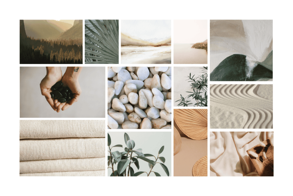
Santa Barbara and Tulum were two particularly strong references. She was drawn to open, airy interiors filled with natural materials, warm light, organic shapes, and tactile surfaces.
We talked about wood, linen, stone, concrete, pottery, rattan baskets, and plants. Spaces that felt clean and organized without being sterile, with enough texture and warmth to feel comfortable and lived in.
There was a subtle balance we wanted to maintain. The brand needed spaciousness and softness, but also enough structure and depth to communicate professionalism. Too little detail could make it feel cold and empty, while too much could undermine the peaceful atmosphere we were trying to create.
Nature became a significant influence, although we weren’t trying to make the brand look outdoorsy. Instead, I wanted to capture the soothing experience of bringing natural materials and organic forms indoors. The visual references included grasses, water, stone, olive trees, croton leaves, abstract landscapes, and the interplay between sunlight and shadow.
We were building a brand that could feel calming without being forgettable, and warm without sacrificing sophistication.
The symbolism of the olive tree
One of the most meaningful elements to emerge from this direction was the olive tree.
Olive trees have long been associated with peace, hope, and new life. They’re also remarkably resilient, with extensive root systems that help them survive difficult conditions and continue growing.
That symbolism connected beautifully with Mel’s approach to therapy.
Her work often involves helping people reconnect with themselves, develop resources for navigating difficult experiences, and better understand the relationship between their bodies and emotions.
The olive tree gave us a way to represent resilience and growth without using imagery that felt overly literal or heavy-handed.
Color, materials, and texture
The material inspiration became so central to this project that it influenced the way we developed and named the color palette.
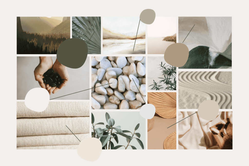
Onyx. Olive. Linen. Rattan.
Those names communicated so much more about the creative direction than simply calling the colors black, green, beige, and tan.
The deeper onyx tones were particularly important. With so many airy, neutral elements, the identity needed something substantial to anchor it. The darker colors introduced contrast and structure, keeping the overall presentation from becoming too delicate or washed out, and also meeting accessibility standards.
Meanwhile, the warmer neutrals and organic textures reinforced the comfortable, welcoming atmosphere Mel wanted to create.
Linen, pottery, natural wood, stone, and soft shadows gave us opportunities to introduce visual interest without relying on busy decorative elements.
I wanted the brand to have a sensory quality to it, almost as though you could imagine how the materials would feel.
For a practice so connected to mind-body awareness and helping people reconnect with their senses, that felt especially appropriate.
Bringing the Brand Identity to Life
Once we had established the strategy and creative direction, I could begin building the visual identity itself. I use the One Concept Method in my brand design process, which means we establish the creative direction together before I develop and present one complete brand identity.
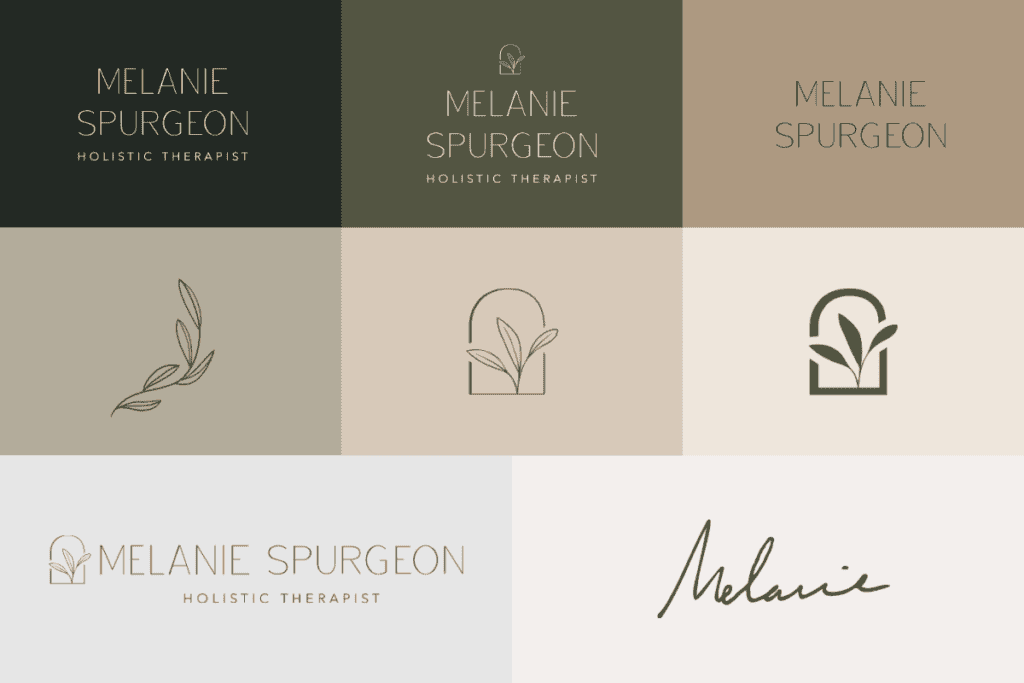
The goal was to create a complete system that balanced credibility with the warmth, gentleness, and organic qualities we had identified throughout the discovery process.
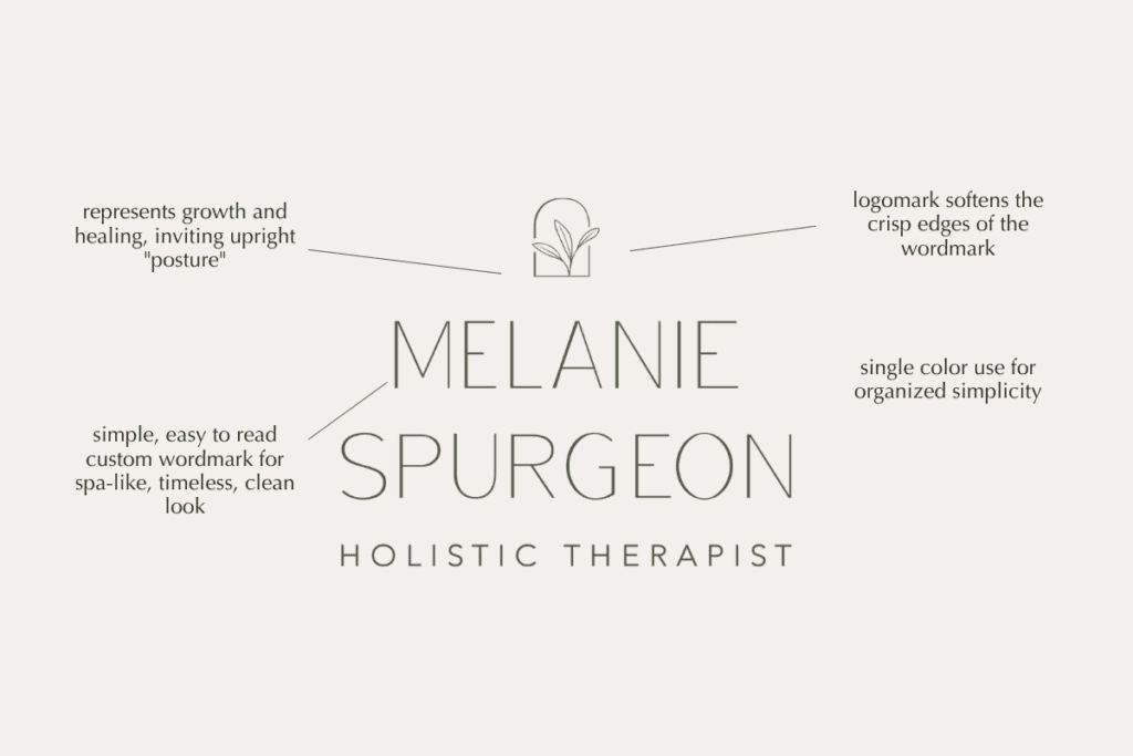
The primary logo is a custom, modern, uppercase sans-serif wordmark with thin, delicate letterforms and generous breathing room. Mel wanted something that felt airy and refined but still carried a sense of strength, and the typography gave us that balance without introducing unnecessary ornamentation.
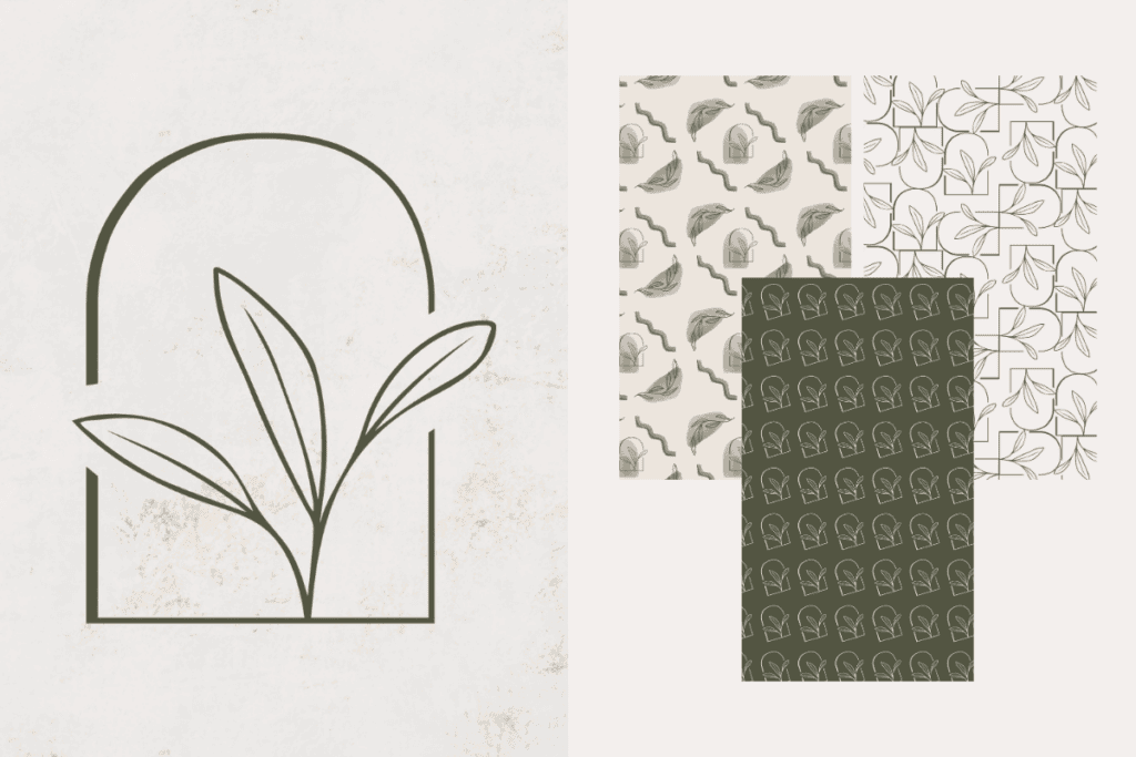
For the submark, Mel wanted to incorporate the olive tree symbolism we’d established during the creative direction process, but in a less obvious way than simply illustrating a tree. I developed an upward-reaching botanical mark to represent growth, framed within an arch that symbolizes new doors opening. I love how much meaning we were able to incorporate into such a simple design, especially considering how closely those ideas connect to the work Mel does with her clients.
We also created a secondary brand mark using Mel’s actual signature. Because therapy is such a personal, relationship-driven service, I wanted her to have an option that felt a little more intimate than the primary wordmark workhorse. It’s a lovely detail to incorporate into materials where a personal touch feels appropriate, while still belonging to the larger visual identity.
Together, the three marks give Mel flexibility in how she presents her practice, from the more structured primary wordmark to the symbolic submark and the humanity of her handwritten signature.
The supporting brand elements were just as important as the primary logo.
I developed a visual language using olive branches, organic shapes, natural textures, subtle patterns, and abstract imagery. These elements gave Mel flexibility to create different types of materials while maintaining a recognizable identity.
Mel would eventually need social media content, educational materials, blog graphics, email marketing, worksheets, and other resources as her practice developed.

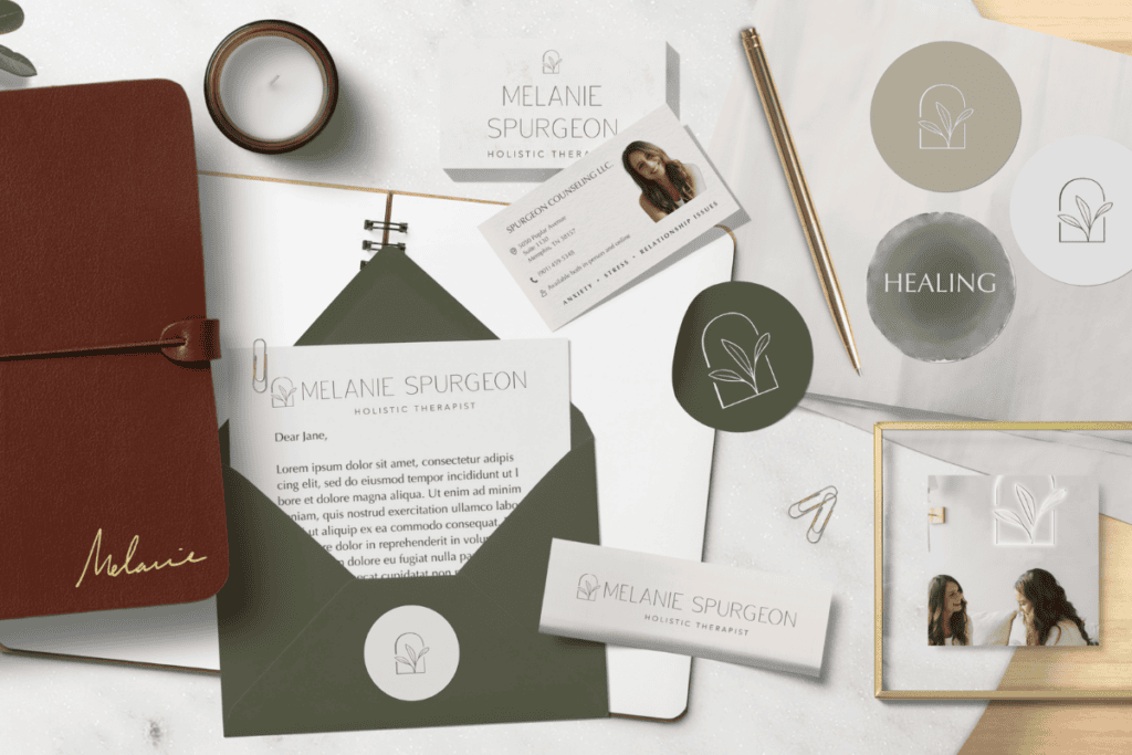
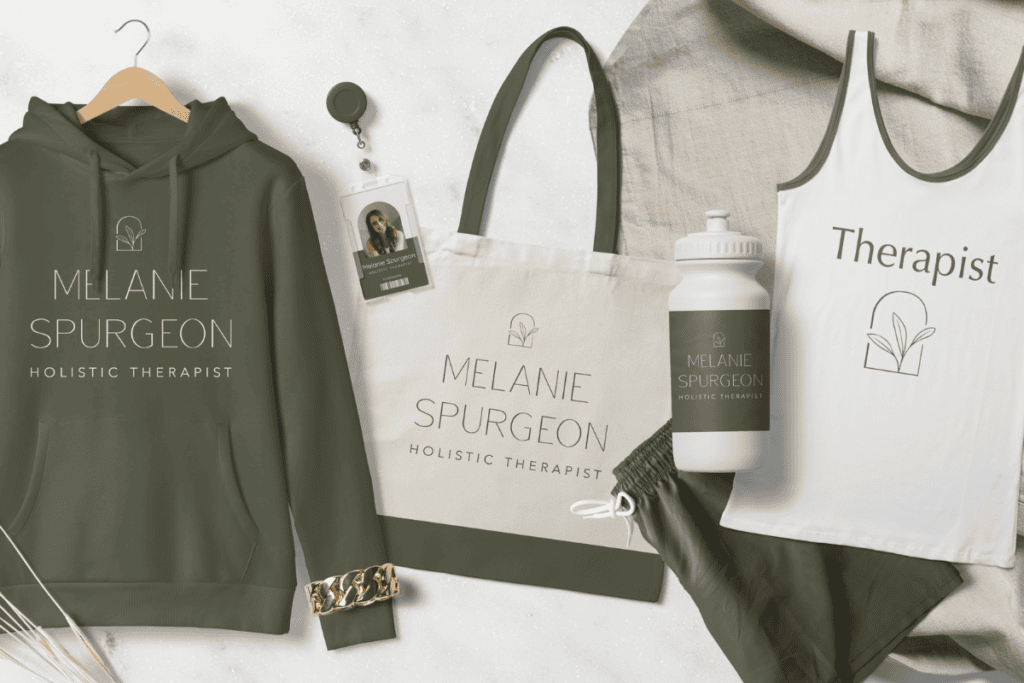
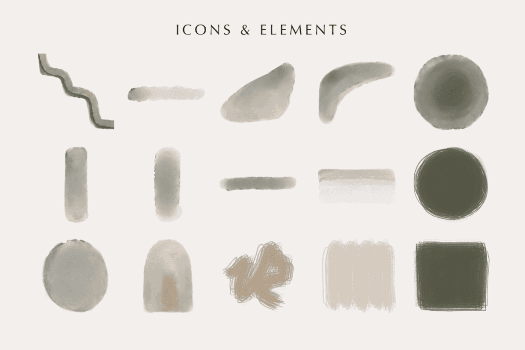

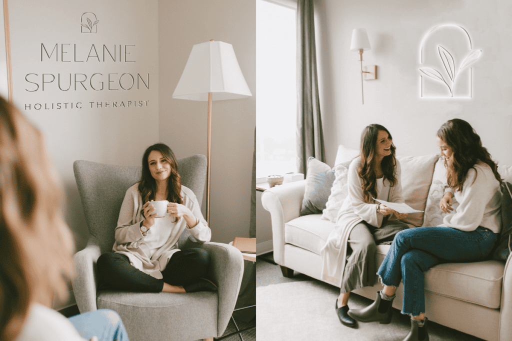
By creating a cohesive visual system from the beginning, we gave those future materials somewhere to come from.
Therapist Website Design Strategy
With the brand identity established, our next step was creating Mel’s first website.
At that stage of her business, a fully custom website wasn’t necessary. We chose an Elizabeth McCravy Showit template as the structural starting point and customized it extensively using the brand we’d developed.


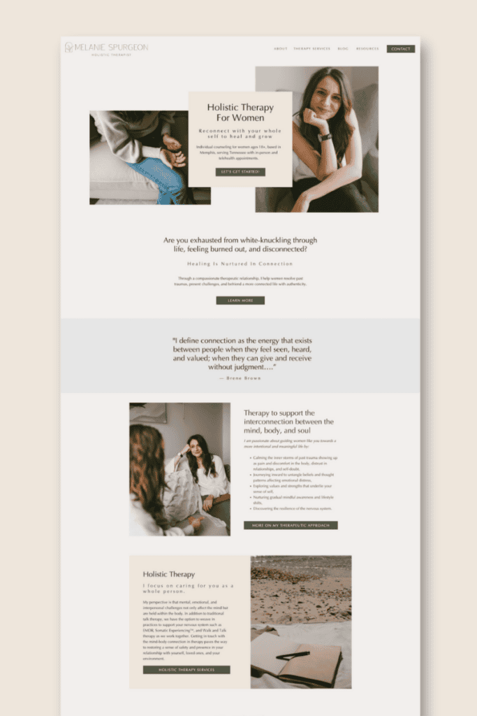
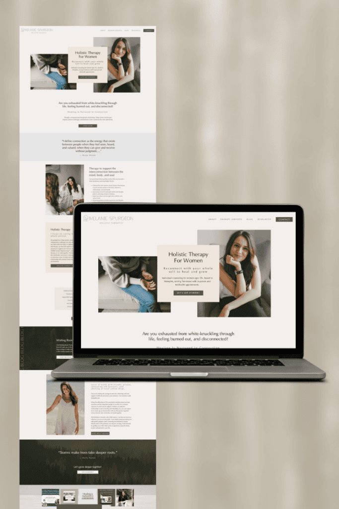
I think templates sometimes get an unfair reputation. A website template is simply a tool. It provides a starting structure, but it doesn’t automatically determine the strategy, personality, or experience of the finished website.
The important question is how thoughtfully that structure is adapted to the business.
Mel wrote her website copy, and I provided editing and guidance as we worked through the content together. We then incorporated her typography, color palette, brand photography, textures, and supporting brand elements into the design.
Since we’d already established the brand strategy and creative direction, we weren’t trying to invent a new visual approach for each section of the website.
We had a strong foundation to work from, which allowed us to concentrate on how the content should be presented and how prospective clients would move through the experience.
Designing around the prospective client’s experience
A therapy website needs to be especially considerate of the circumstances that might bring someone there.
A visitor may be researching therapists after a difficult day, trying to understand whether a particular approach could help them, or feeling nervous about reaching out for the first time.
The website shouldn’t make that process add more stress to this person’s life.
We wanted visitors to be able to understand who Mel works with, the concerns she helps address, her approach to therapy, and how to take the next step.
The design carried the spaciousness and warmth of the brand identity into the online experience, with readable content, intuitive navigation, and enough visual breathing room to keep the information approachable.
Helping Mel feel confident with the technology
There was another important part of this project that doesn’t exactly show up in the finished website.
Mel was navigating a lot of unfamiliar technology as she prepared to launch her practice.
Website platforms, domains, email systems, forms, and other technical considerations suddenly became a regular part of running her business. So our work included education and support alongside the design itself.
I wanted her to understand how the pieces connected, what she needed to maintain, and how to use the website confidently once it was live.
I never want someone to invest in a beautiful website only to feel intimidated by the thought of actually using it.
Mel has since shared that our work helped her feel more confident in what she was building. The branding process also helped reconnect her with her why as a therapist during a season when she was preparing to publicly introduce her work.
The Final Result
The finished identity brought together everything we’d uncovered about Mel’s approach to therapy: compassion, curiosity, gentleness, connection, and an appreciation for the relationship between mind and body.
Natural textures and organic imagery created a peaceful, welcoming atmosphere, while the deeper colors and structured typography provided the professionalism and substance the brand needed.
The customized Showit website carried that same experience online, giving prospective clients an introduction to Mel’s practice that felt consistent with the way she described her work.
And Mel had a visual foundation she could begin using as her practice developed.
“Stephanie’s kindness and patience with my struggle navigating technology helped me push forward when I was starting to second guess if I could actually run an online platform. She never shamed me for not understanding something, but rather she willingly took the time to educate me!
My main concerns were navigating technology and that I would feel overwhelmed and confused but Stephanie broke down the process to different programs in a way that settled my fears!
The branding processes helped me connect more to my “why” behind being a therapist, and this was grounding and clarifying before taking the step to share more publicly about they therapy I offer. Although I had to confront some of my imposter syndrome, persevering with copywriting and leaning into the creative process has increased my confidence!
Boy did I experiencing limiting beliefs! Multiple times I wondered if I made a huge mistake getting into the weeds of the online world. The more I continued pressing on and asking Stephanie for help, her kindness and patience helped me believe that its a process and its ok to mess things up, play around, and experiment.
My fears about investing in the process came more from my self-doubt and hesitancy with committing to myself and the work I want to do. Stephanie’s encouragement and excitement about the project and as I saw things slowly come together I started to believe that the therapeutic work I want to offer is worth investing in.
Your doubts will pass. If you have been dreaming about this as long as I have, the fear of actually moving forward might freak you out a little bit, but just go for it. Your passion and care is strong enough to overcome your fear of success and hard work.
She just had so much confidence in me and our project, so then seeing the vision that has been growing in me for the last three years come to life as Stephanie pulled the inspiration out of me has given me the support and encouragement I needed to move forward!
I would absolutely recommend Stephanie’s brand services to others! Her patience, her skill in educating people on how different web programs work together, and her kindness when I needed more time to get adjusted helped me believe I could do this!
She is such a great guide and designer to help make your website dreams come true, even if technology isn’t your best friend! I never thought I could handle everything that goes into starting an online platform, but Stephanie gave me the encouragement, support, and creative ideas I needed to get my therapy practice branding off the ground! I have learned so much from Stephanie, she truly goes the extra mile and willingly answers all your questions, no matter how basic!”
If you’d like to see more of the visual side of this project, you can click here to view the portfolio page.
Three Years Later: A Brand That Continues to Grow With the Business
When we completed Melanie Spurgeon’s original brand and website in 2023, we couldn’t have predicted every resource, marketing initiative, or technical system her business would eventually need, and we didn’t have to.
The point of developing a complete brand system is to create something flexible enough to support future decisions, even when you don’t know exactly what those decisions will be yet.
Over the following three years, Mel continued building her practice and developing new ways to connect with and support her audience.
We’ve continued partnering on website updates, email marketing, lead generation, and the technical systems that support those efforts.
One of our more recent projects has involved the marketing and delivery experience for Nurturing Resilience: A Guide for Regulating Stress, an educational resource Mel created to introduce practical mind-body techniques for navigating stress and feeling disconnected.
That work involved much more than designing a promotional graphic.
We considered how someone would discover the resource, sign up to receive it, access the material, and continue engaging with Mel’s content afterward.
We worked on signup forms, Flodesk email delivery, and a reusable thank-you page that gives subscribers opportunities to explore her blog, connect with her on social media, or reach out directly.
We’ve also handled the less glamorous technical pieces, including email domain authentication and the various integrations that keep everything working together.
Those details might not make for particularly exciting portfolio imagery, but they’re important parts of the experience someone has with a business.
And through all of these new projects, there’s one thing we haven’t needed to do: reinvent Melanie’s visual identity.
The brand we developed in 2023 continues to provide the creative foundation for everything we’re building today.
New materials can look and feel consistent with the original website because we established the visual language from the beginning. Instead of approaching every project as a completely separate design challenge, we can focus on what the new piece needs to accomplish and how it fits into the larger business.
For me, that’s one of the strongest measures of a successful brand identity.
It’s not simply whether everything looked beautiful when the project was completed. It’s whether the business can continue using what we created as its needs evolve.
What Makes Great Therapy Branding?
One of the biggest misconceptions about branding in the mental health industry is that a therapy practice needs to look a particular way to communicate compassion, professionalism, or safety.
I don’t believe it does.
Your industry provides useful context, but it shouldn’t determine your entire creative direction.
What’s more important is understanding how a particular therapist approaches her work, what her clients appreciate about that experience, and what makes her perspective distinctive.
That’s where the most meaningful creative direction comes from.
For Mel, we started with words like relational, compassionate, grounded, and calm. Those descriptions alone could have led us toward dozens of different visual approaches.
It was the deeper exploration of her values, personality, preferred environments, and therapeutic philosophy that brought us to olive trees, natural stone, linen, onyx, organic forms, and warm, sunlit spaces.
Those details made the brand specific to Melanie Spurgeon rather than simply recognizable as another therapy practice.
And because we developed them as part of a complete system, they’ve continued supporting her business long after the original project ended.
Looking for a Therapy Brand & Website That Reflects the Way You Practice?

Your credentials, training, and professional experience are important parts of your business, but they aren’t the only things prospective clients want to understand.
They’re also trying to get a sense of who you are, what you believe, how you approach your work, and whether your practice might be the right fit for them.
Your brand should help communicate those things in a way that feels thoughtful, distinctive, and consistent with the experience you actually provide.
Whether you’re preparing to introduce a new practice or you’ve spent years building a reputation that your current branding doesn’t adequately represent, I’d love to partner with you to create something that supports where your business is headed next.
Some links on this page may be affiliate links. I only recommend tools I personally use and trust.

Website Planning 101

These resources are pulled directly from the same materials and frameworks I use with my clients — designed to help you think through your brand and website with more clarity and intention. Consider this a behind-the-scenes look at how I approach the work.
A peek inside my process
From the Studio Library

I create thoughtful brand identities and custom Showit
websites designed to bring clarity, cohesion, and direction to your business — so everything finally feels like it fits.
I’ve worked with businesses across a wide range of
industries, but the goal is always the same: build something intentional, aligned, and bookable.
And yes… it gets to look really good too.
