


If you haven’t read How to Use Trends in Your Content Marketing: Part 1 – I’d like to encourage you to go read it next! To give you a quick rundown of that article though, I talk about platforms to consider for your content marketing and content marketing trends. This included topics like AI, short-form video, and UGC creators. It was a really interesting conversation and one that complements this article well. Which is why it’s a 2-part series, ha!
But in this article, I will be covering trends in my wheelhouse – graphic design. In case you don’t know me, hi I’m Stephanie – a brand and Showit website designer (you can learn more about me here if you’re curious) so this is where you’ll get to see me really geek out over fun things like colors and fonts, and textures. Without further ado, let’s get right into it!
What is a trend?
To start, just like in part 1, let’s define what a trend even is. According to Vocabulary.com, a trend is what’s hip or popular at a certain point in time. Simple. We see trends in all kinds of industries, especially in creative fields like graphic design, architecture, fashion, and film. It’s really interesting to look at graphic design trends because much like fashion trends, they come and go so quickly, as well as repeat themselves over the course of time – albeit in different forms than they did originally.
You can look at the examples of trends I discuss in this article and see the historical art movements they’re pulling inspiration from. We intrinsically cannot create something from nothing as humans. We have to gain inspiration from somewhere. Our own personal experiences in the world, books, films, and history – to name a few.
This doesn’t mean the things we create can’t be unique.
Nobody in history has had the exact same life experience as you. Nobody has the exact same passions or aversions or abilities as you. Nobody has lived in this exact moment in history in the same place in the world as you. So of course you will have original ideas, but those ideas are shaped by your experiences and what you intentionally or unintentionally surround yourself with.
How trends are created
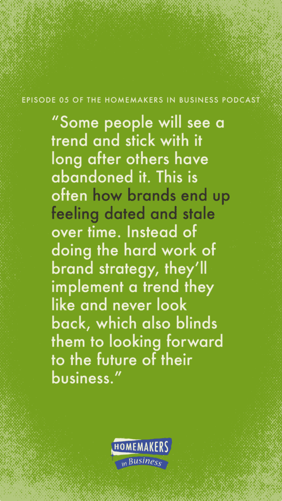
Trends themselves develop based on the current political, economic, and cultural climate. You’ll typically see a trend come into the mainstream due to a significant event and it’ll fade out as another event approaches. Some people will see a trend and stick with it long after others have abandoned it. This is often how brands end up feeling dated and stale over time. Instead of doing the hard work of brand strategy, they’ll implement a trend they like and never look back, which also blinds them to looking forward to the future of their business.
In this article, I’ll talk about how you can play with trends in your content marketing, but avoid the mistake of making a trend your brand’s identity, as well as take a look at a brand that does this well. By the way, in the article What is Branding? I clarified a lot of these “brand” words so if you get lost or confused, go give that a read and then come back here!
2023 Graphic Design Trends
To start us off, here’s a list of current graphic design trends and trend predictions for 2023. I’ll include some name variations that you may have heard also. You may not be able to visualize them well based on their name but give me a moment and I’ll describe them in detail as well as show you some examples.
- 90s/2000s revival
- Gradients
- Neon-futurism
- Retro
- Minimalism
- Anti-branding
- Type-centric
There are some others that could be included, but I think 7 is a nice number to go with and this covers the majority of what you are probably already seeing online.
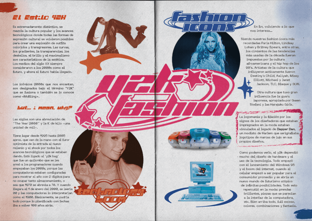
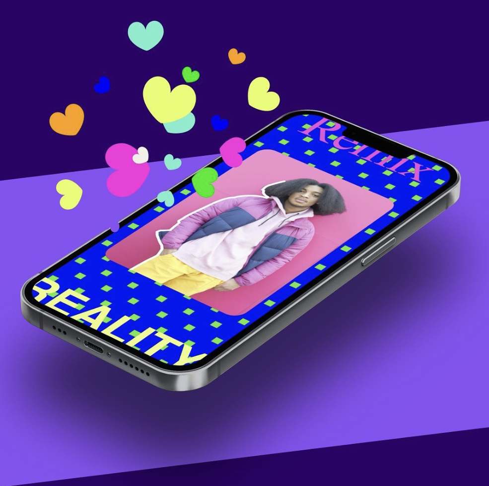
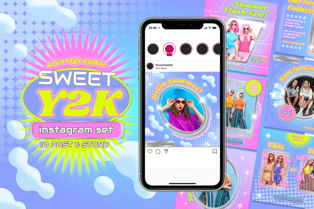
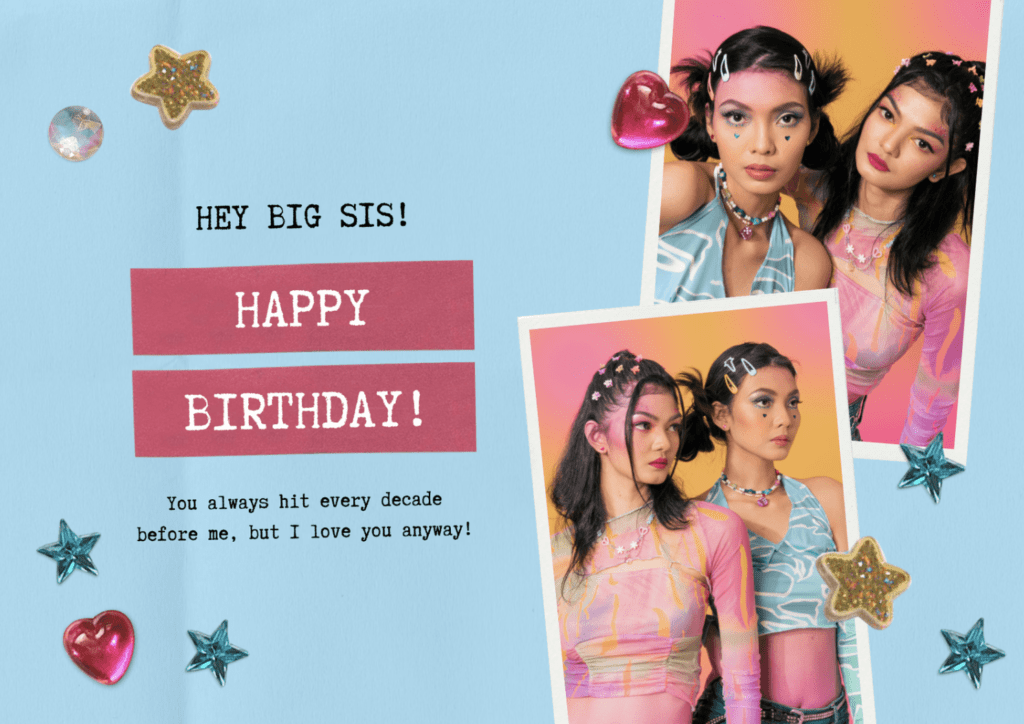
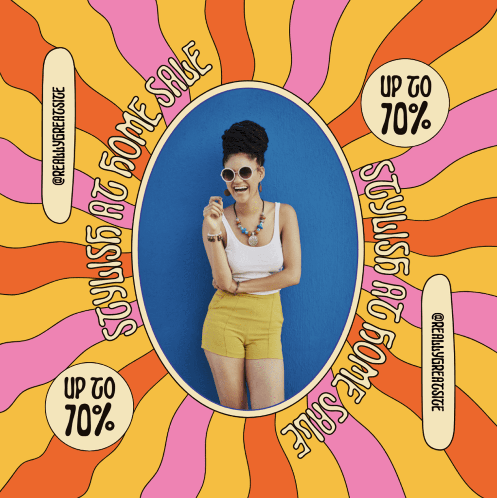
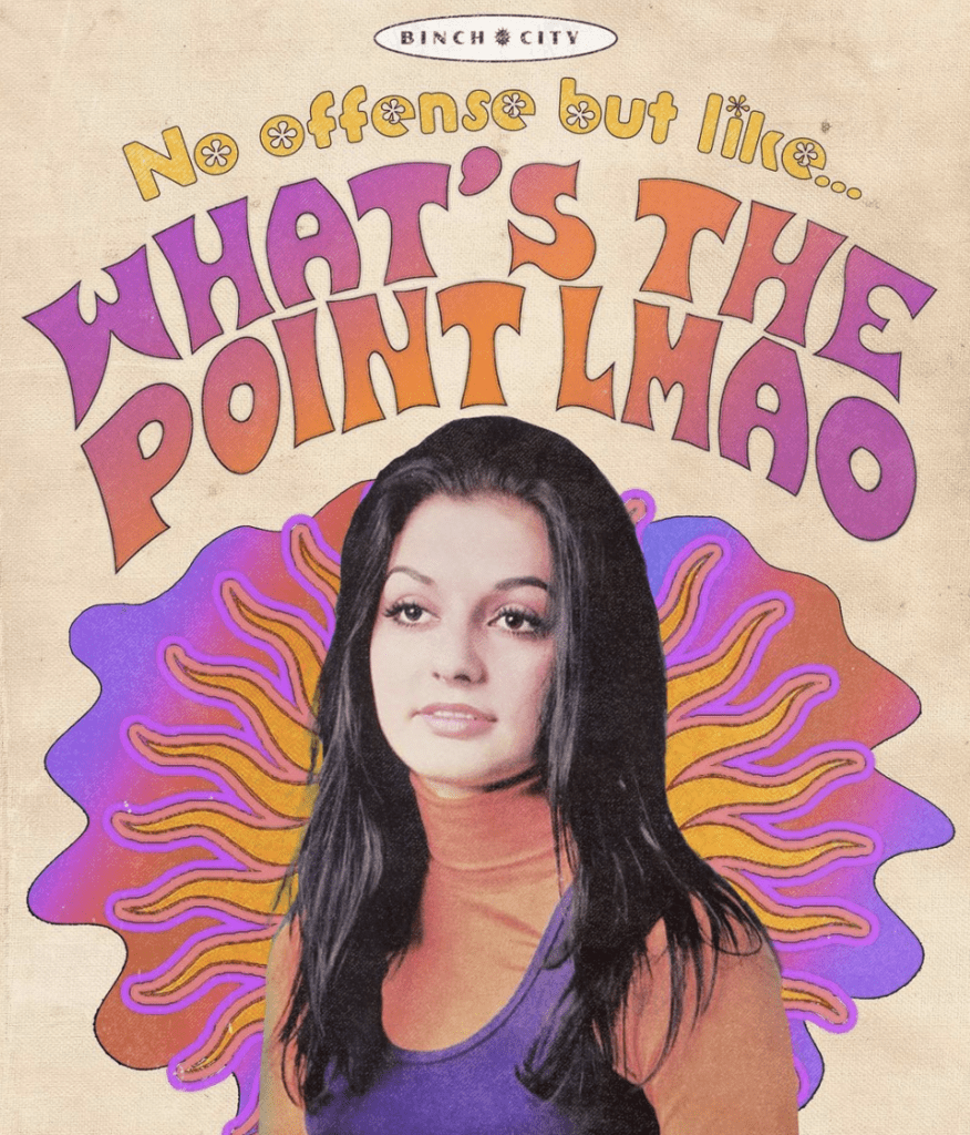
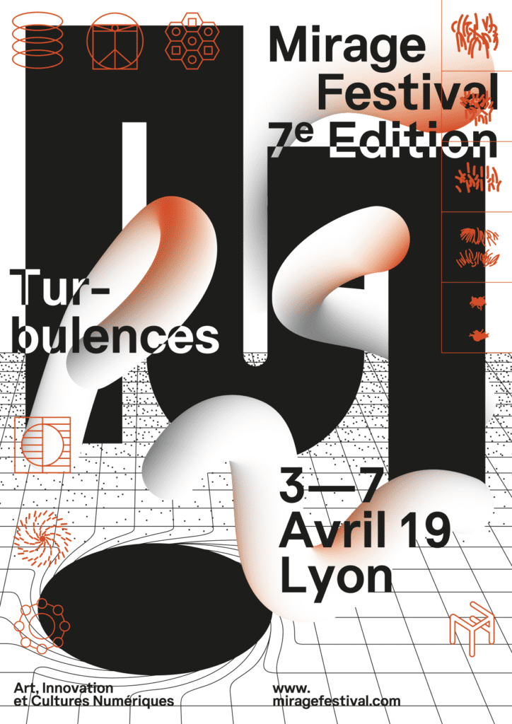
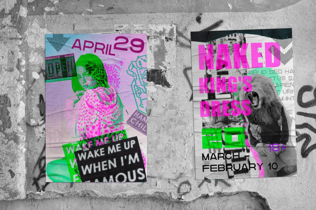
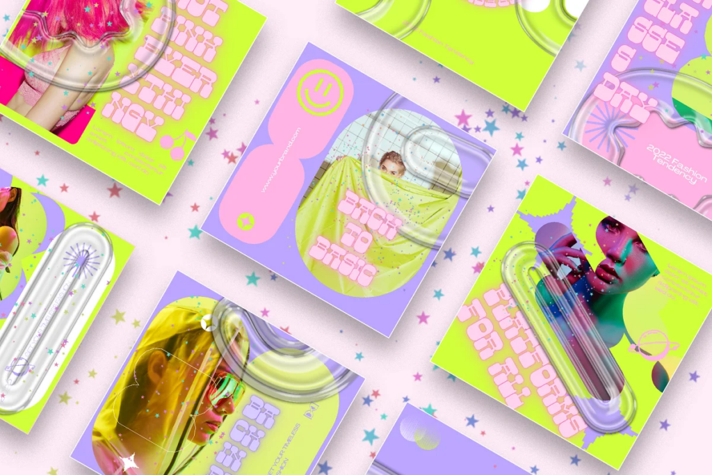
90s/2000s revival (aka 90s space psychedelia, Y2K evolution, 90s and Y2K nostalgia, Y2K grunge)
There are lots of names this trend goes by, but this is currently the most notorious trend thanks to Millennials, Gen Z, and TikTok. As a #90sbaby, I absolutely love it. It is full of nostalgia, including design elements of Memphis patterns (which is technically 80s, but the 90s often claim it), Lisa Frank, magazines, collages, bedazzling, grunge, glitches, butterflies, clouds, sparkles, lots of colors, and so much more. This design style can include a lot of varying elements, but it is always obvious when you see it.
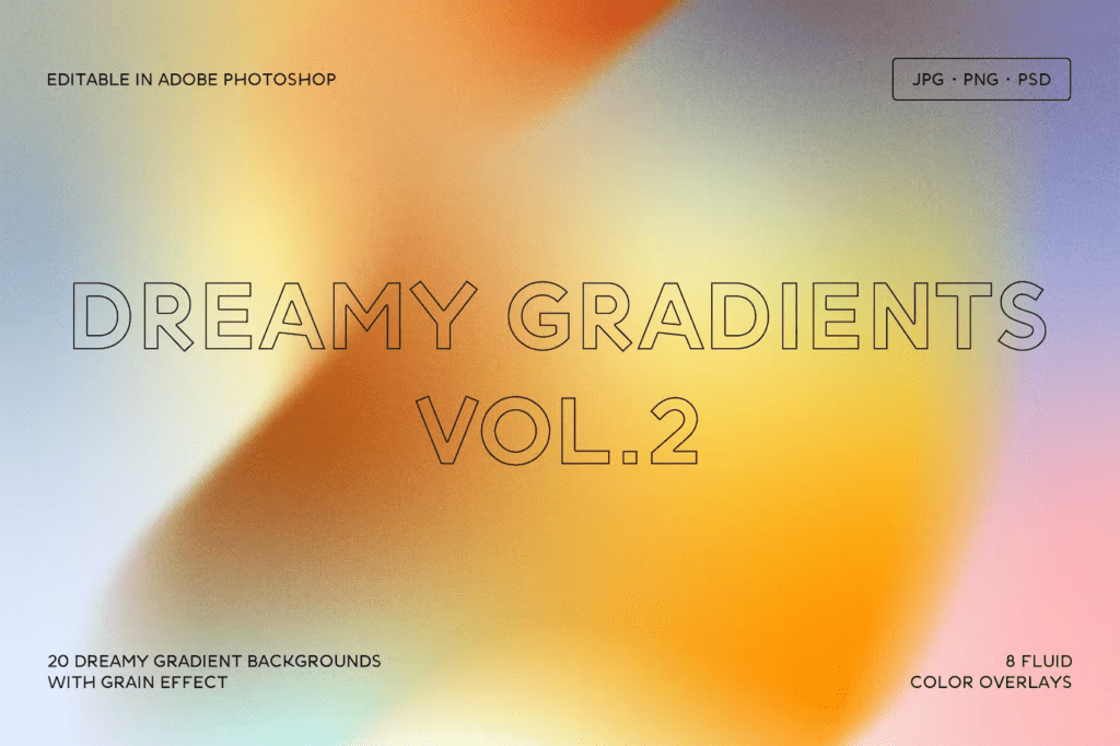
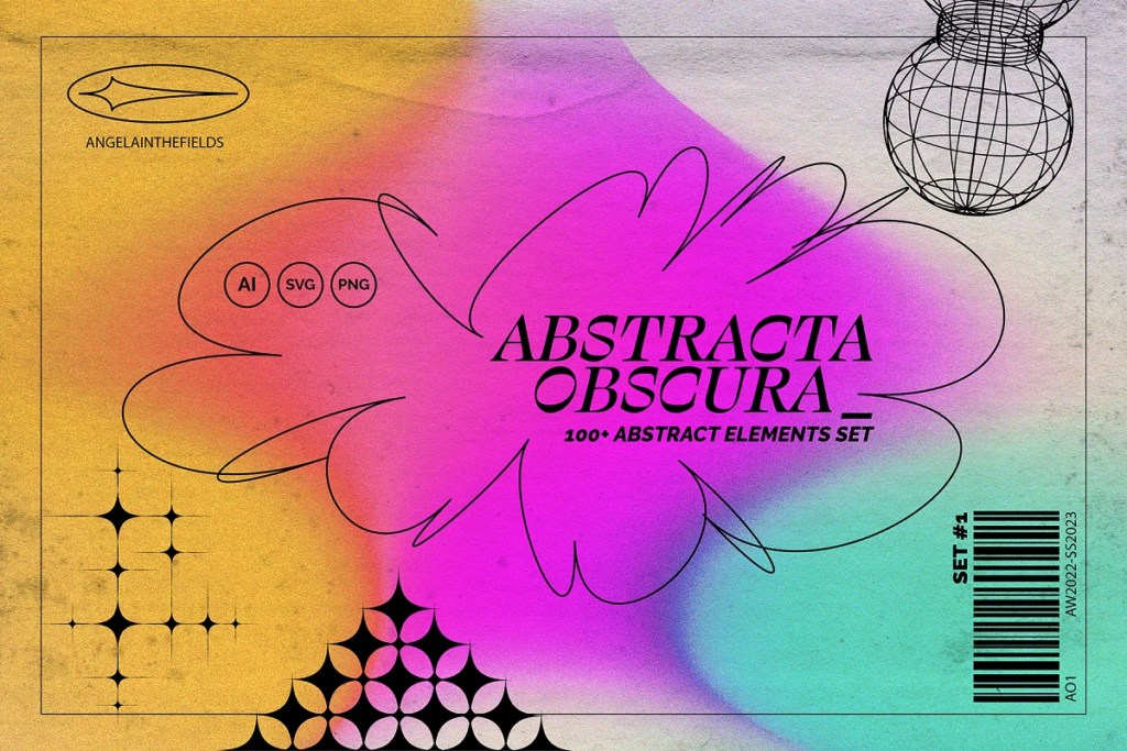
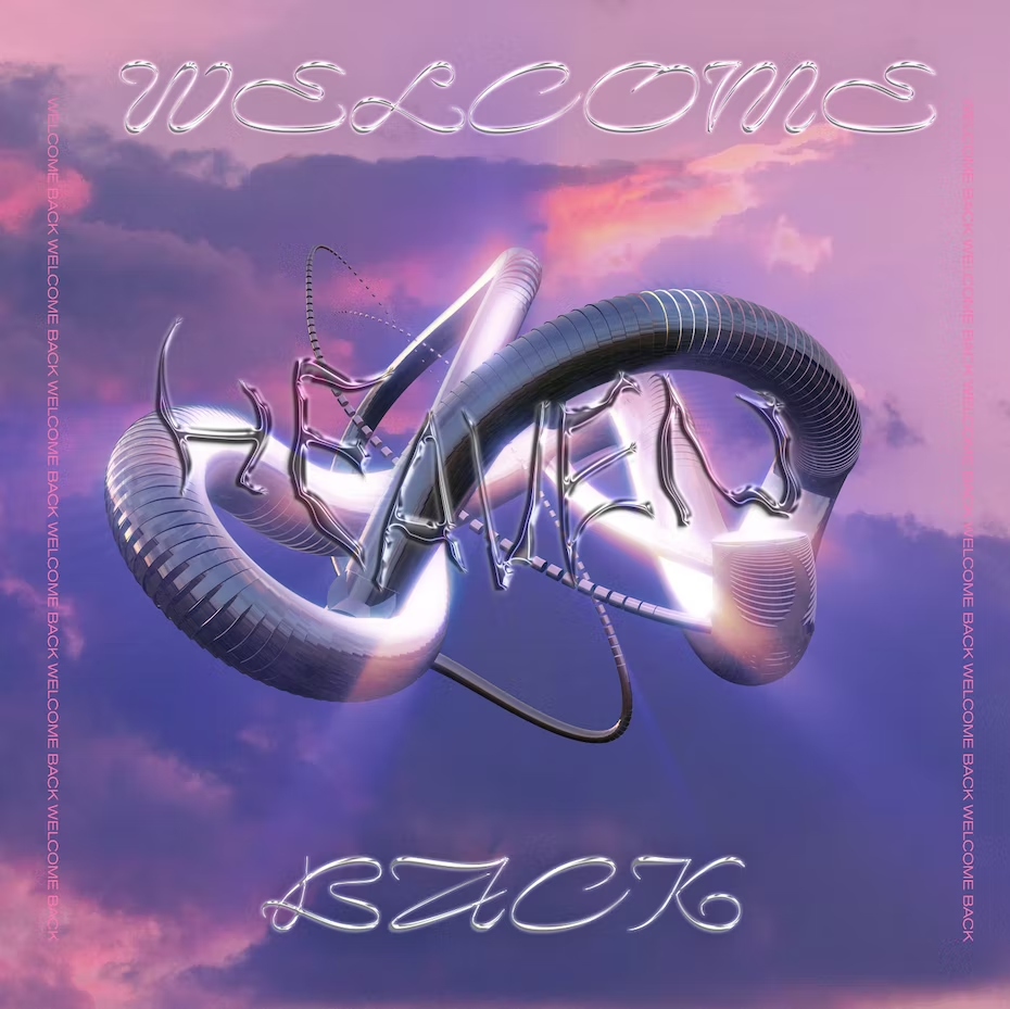
Gradients (abstract gradients, liquid gradients, radiant gradients, trendy gradients)
At its core, a gradient is simply a smooth color transition. It can be blue slowly transitioning into yellow, a single color transitioning into a transparent background, or multiple colors transitioning into one another in a more nonsensical way. These have been popular for a while, and I don’t see this trend going anywhere anytime soon.
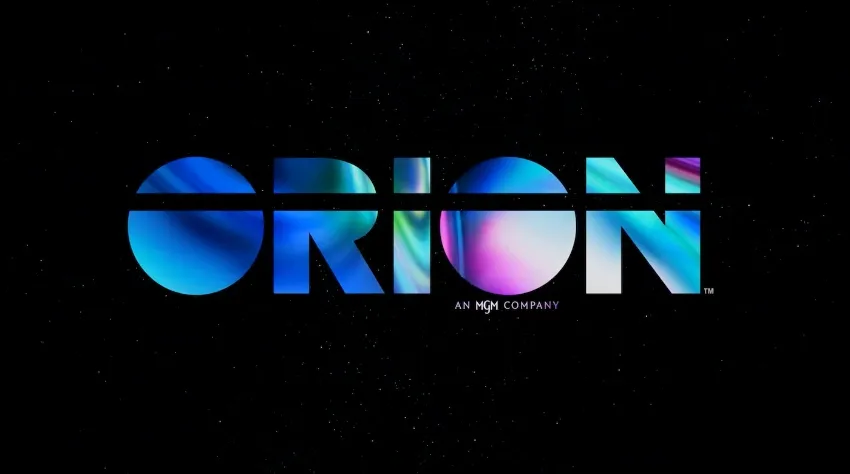
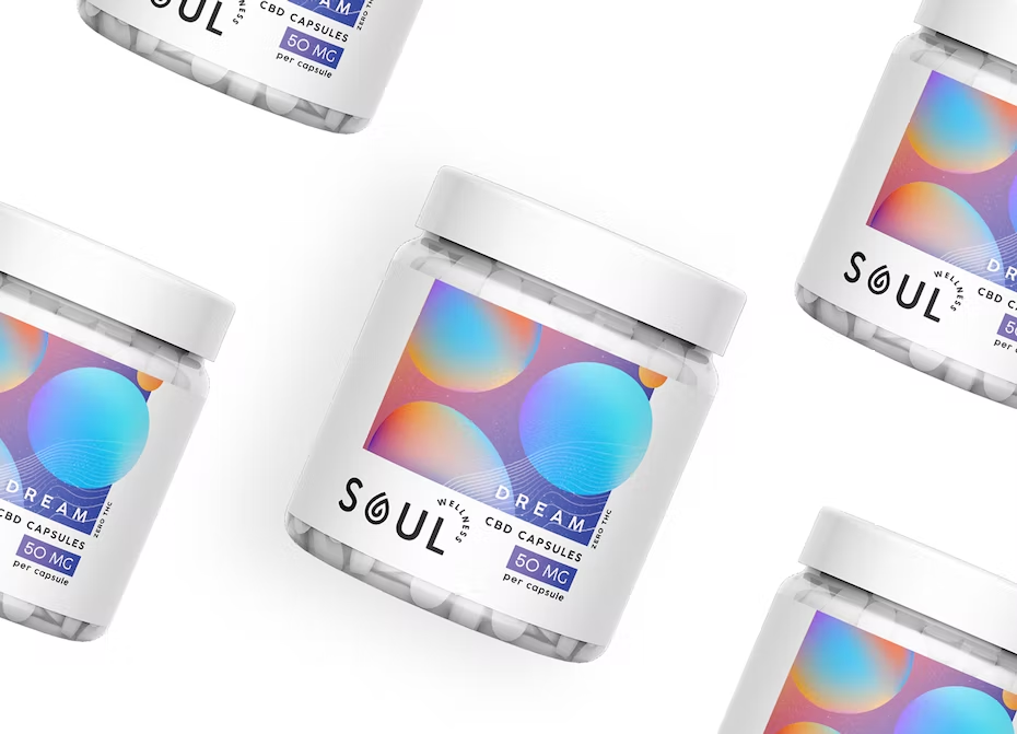
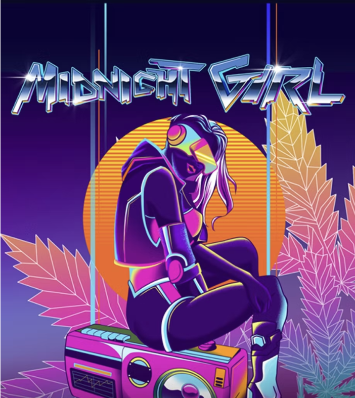
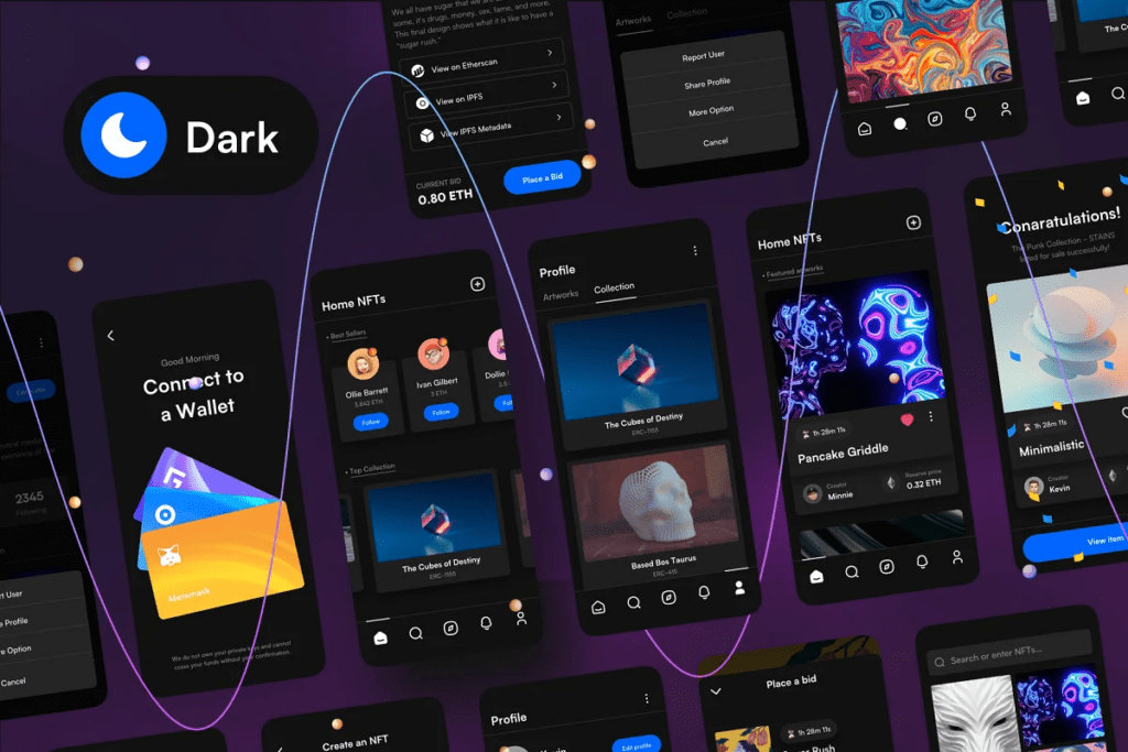
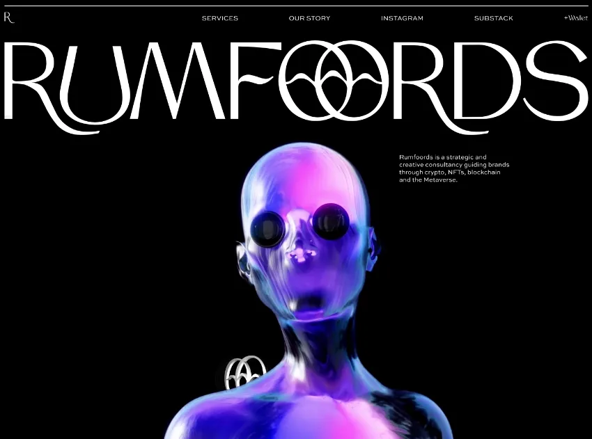
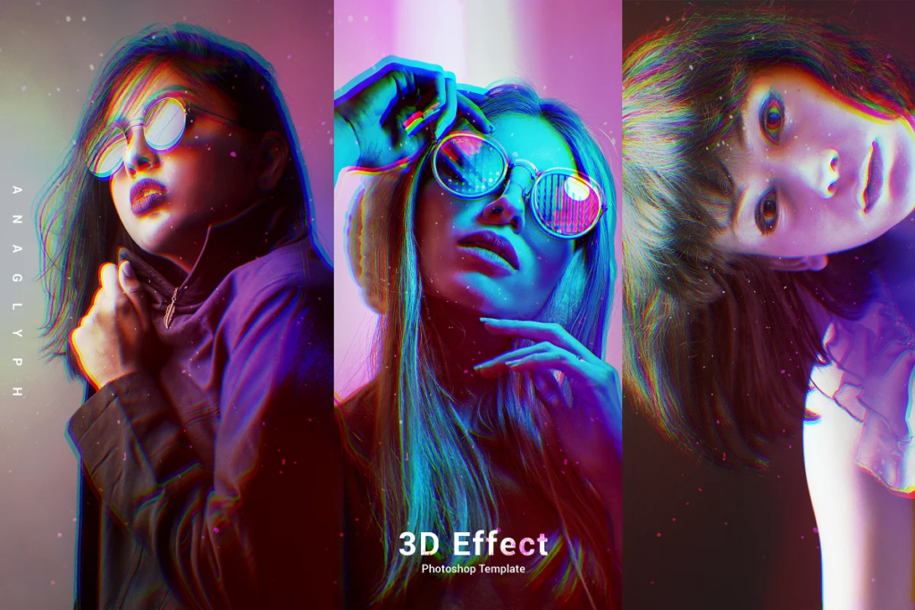
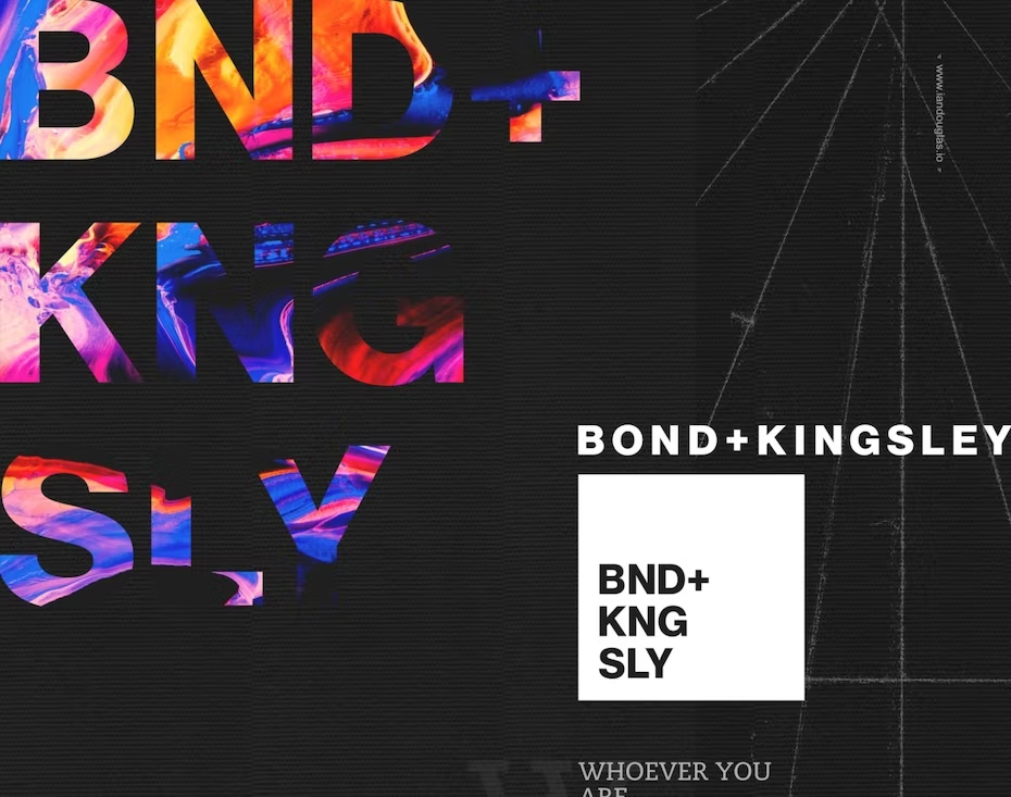
Neon-futurism (airbrush surrealism, acid graphics, metaverse)
Not to be confused with neo-futurism, which does have similar characteristics, but it’s not what I’m talking about here. Neon-futurism is my own term for the broad category of futuristic design styles. As the name suggests, it includes loads of neon colors, futuristic shapes, and fonts, interesting textures, and even gradients. You’ll begin to see how some of these trends overlap with one another.
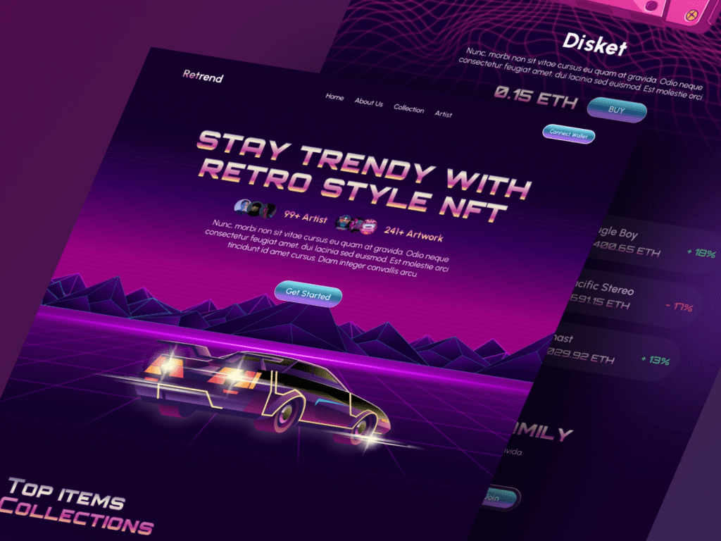
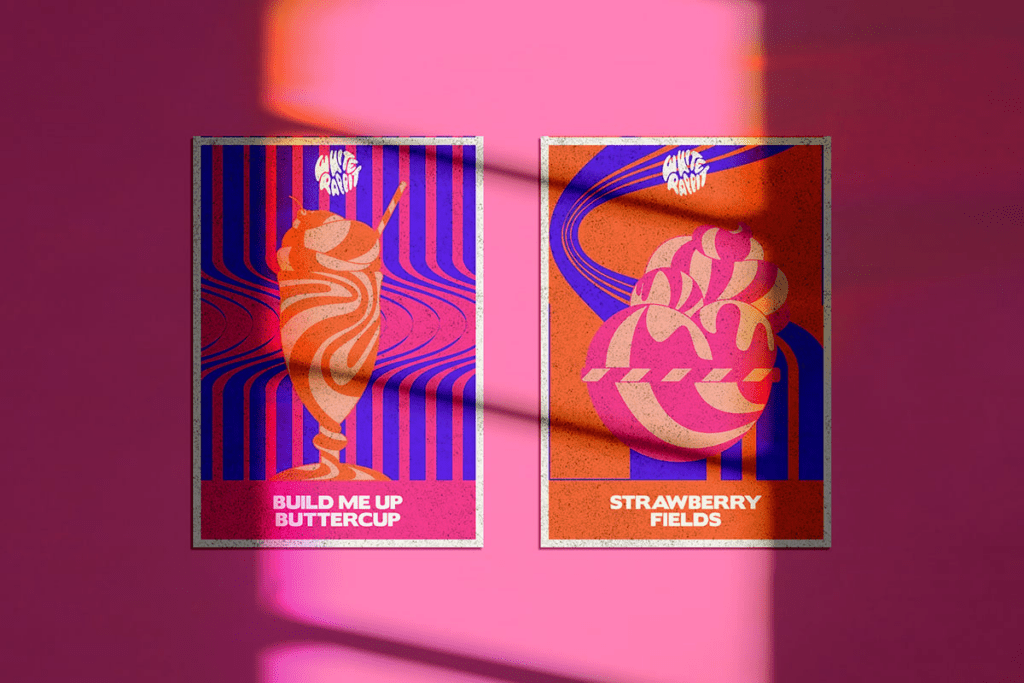
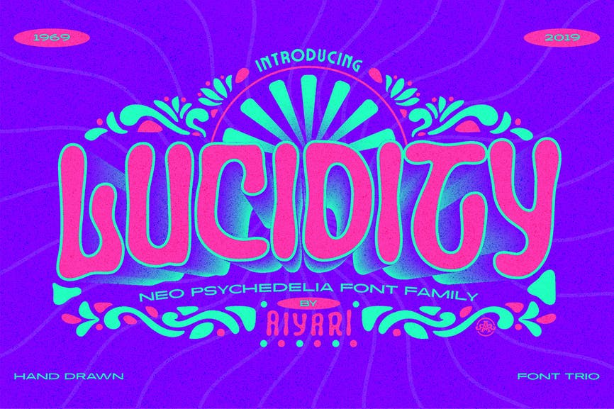
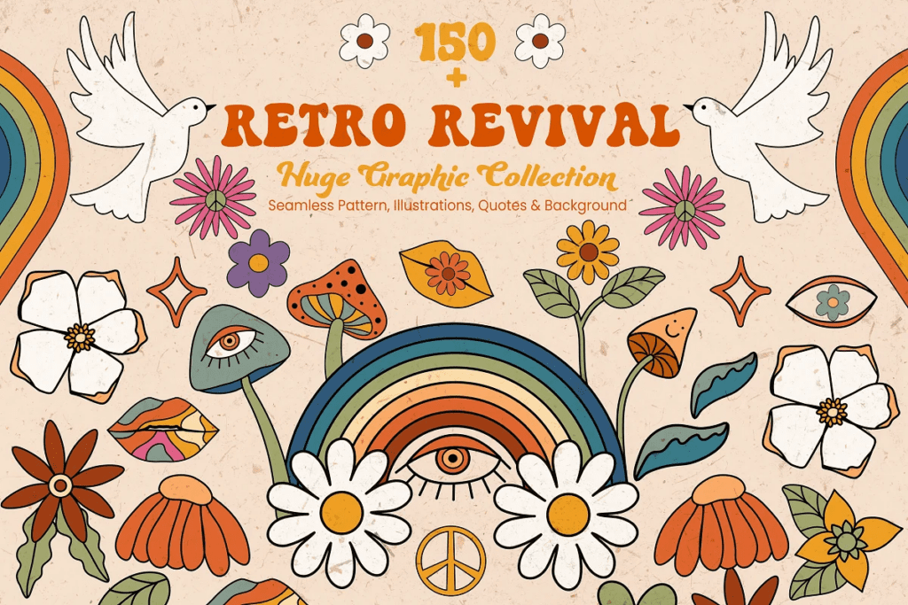
Retro (60s/70s, groovy, hippie)
If you can’t pick out the 90s/2000s trend, you surely can identify retro. It’s characterized by bold stylistic typography, fluid patterns, bright oftentimes clashing colors, and flat shapes. While the term retro can technically refer to any decade in the past, here it is most definitely referencing the most iconic 60s and 70s design styles.
Minimalism (minimal vintage, vivid minimalism, true minimalism)
Quite the contrast to the previously mentioned trends, minimalism is, well, minimal. It relies heavily on negative space, typography, color, and not much else. Regardless of if the colors are neutral or vivid, minimalism seeks to use the least amount of visual cues to get its point across.
Anti-branding (collage, scrapbook, punk revival, anti-design)
And to juxtapose minimalism, anti-branding is basically breaking every design rule there is. It ignores symmetry, alignment, hierarchy, proper contrast, and balance, among every other design principle. It rejects specific aesthetics, leaning more toward the idea that there should be alternatives to accepted design standards.
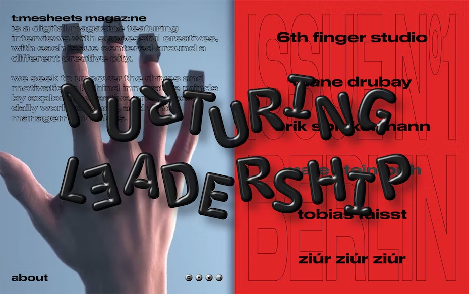
Type-centric (editorial, condensed typography, creative typography, 1980s advertising)
I most often see type-centric design using very editorial style typography, but it can be done with virtually any type style. The point of this trend is for the typography (the font) to be the focus of the design. You’ll see a lot of education-based social media accounts applying this trend to their posts so that it’s easy to skim their content for what you’re looking for. It usually makes a pretty bold statement.
How you can put these trends to work for your brand
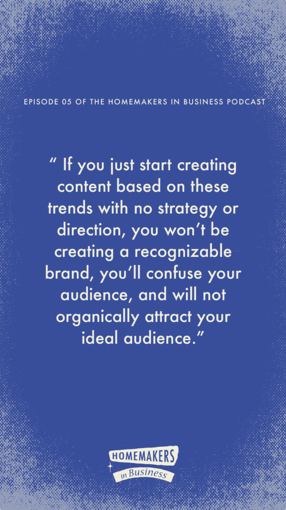
Ok, so how can you play with these trends in your content marketing, but avoid the mistake of making a trend your brand’s identity? First, you have to have an existing brand identity (check out this article if you need a refresher on what that is). If you just start creating content based on these trends with no strategy or direction, you won’t be creating a recognizable brand, you’ll confuse your audience, and will not organically attract your ideal audience. The foundation of using trends well in your content marketing is having a solid brand identity.
If you don’t have a brand identity, then that is where you need to start. If you’re new to business, DIY your brand identity in Canva. Yup, I the brand designer, just said to DIY your brand identity in Canva. This is ONLY if you are new in business and have no funds or strategy to invest in a professional designer. If you have been in business awhile and are seeing success, it may be time to invest in professional branding. I happen to know a gal. *wink, wink.
How to DIY your brand identity in Canva
To DIY your brand identity, create a simple color palette of NO MORE than 2-3 contrasting colors plus black and white. Choose 1-2 fonts that you will use consistently in ALL of your marketing, including your website. And please don’t use a Canva logo template. I say this because literally MILLIONS of people use those logos. You’ll be much better off if you make yourself a simple font-based logo that is just your business name. No icons, imagery, or illustration. Add a tagline if you want, but keep. It. Simple. Use a legible font that people can actually read. Save it in black, white, and 1 color with a transparent background. Now use that logo, your color palette, and your fonts in your marketing consistently.
DO NOT DEVIATE FROM IT. It’s totally fine to use Canva social media templates for your marketing but always use your own brand identity.
If you do have a professionally designed brand identity that you’ve been using for at least several months, you’re in a great position to start playing around with design trends. Let’s discuss how to do that.
Marketing campaigns
I believe the BEST way to use trends to your advantage is to use them in a dedicated marketing campaign. A campaign is simply when you commit a period of time to promote a specific product or service, so it’s not something you do for months on end. It has a clear expiration date so you can go back to your “regularly scheduled programming” once the campaign is over.
The reason I think this is the best way to apply trends is that trends are eye-catching and attention-grabbing, and most people stop their scroll if they see a trend being used with familiar elements of your core brand identity.
Take the 90s/2000s trend for example. If even part of your target audience – meaning the people you create your product or service for – is in the Millenial or Gen Z age bracket then you should totally try this trend in a marketing campaign. This will spark buzz and get people excited to share your content because the nostalgia of this era is something we can all relate to. This applies to the retro 60s/70s trend and any other noteworthy generational trend that may pop up.
Now, obviously, there are caveats to this and you should know your target audience well enough to discern if a trend would resonate with them at all. But generally speaking, it’s way safer to try out a trend in a temporary campaign than it is to start using a trend in your daily marketing.
Holidays
Holidays are a great time to use design trends since we typically use design styles during the holidays that aren’t necessarily our usual design style anyway. You often see companies dawning red, green, and white with script fonts for Christmas, pastels and juvenile fonts for Easter, and red, white, and blue accompanying a fireworks illustration for the American 4th of July.
But what if you went totally against the grain and incorporated a trend like Gradients or Anti-Branding in your holiday content? You could maintain your primary brand colors, but change up the application by using unique gradients as a background image or color your text. You could make a loud, disruptive collage of your own brand photos but add holiday-themed stickers and font styles for the Anti-Branding look.
Oh, you could even do a fun holiday campaign like “Retro Christmas” and use the Retro trend to inform the type of content you make, not just the style. Seriously so many fun possibilities!
Collaborations
Collaborations are an important part of business. A collab could simply be you interviewing someone on your podcast, creating a product with another business owner, or hosting an event at a local coffee shop. The more you hype up both your and your collaborator’s audiences for the event, whether that’s a literal event or a launch, or something else, the more successful the collaboration will be.
The question becomes what does your collab marketing LOOK LIKE? Do you use your brand identity or theirs or a combination of both? I say, why not use a neutral trend to promote your collaboration? By neutral, I mean a trend that isn’t going to be super in your face (like Neon-Futurism). A great option would be Minimalism. This doesn’t mean boring or lacking personality, but you could use one person’s fonts and the other’s colors and that’s the extent of the branding. Or Type-Centric would be awesome. Find creative ways to use typography.
Use Relevant Elements
I love that this rhymes, haha. What I mean by this is you can use parts of a trend in your actual brand identity. It’s not illegal. Most brand identities are based on what was once a trend or multiple trends.
While Gradients are super trendy right now, they are found everywhere in nature and have been used in graphic design forever. In fact, gradients are an element of trendy 90s/2000s design. It’s just the application that is really trendy right now. So mull over these trends and see what different elements might feel at home in your current brand identity or might make their way into a future rebrand for you.
The key to doing any of these trends well is to not do them too often, back to back, or for too long. Think of your usage of the trend as a trend. It’s not here to stay. It’s short-lived, so treat it as such.
You don’t want to completely abandon your brand identity for even a temporary trend, however. This is because it will be TOO difficult for someone to recognize the content as yours. So continue using your brand photos, your logo, and possibly your fonts or colors depending on the trend you’re using to maintain a level of recognition.
Now, let’s talk about why you shouldn’t make an entire trend your brand identity.
As mentioned several times now, a trend is temporary. It may last for a few days, weeks, or even years, but it is not permanent and will eventually look dated. Think back to how websites looked in 2000. Man, I get a headache thinking about this, haha. More is more was the idea. Glittery sparkling text, glossy buttons, animated cursors, insane amounts of text on the screen. These were all super popular trends of the time, but your website would look very dated and possibly even untrustworthy if you were using those stylistic choices in 2023.
This is why it’s important to have a brand identity that will stand the test of time. If you’re still selling the exact same product or service to the exact same target audience in 20 years, you don’t want to be forced to rebrand. You’d prefer to do a brand refresh, which keeps your core identity intact and recognizable, but gives your brand a slight facelift.
I’m just going to mention one single brand that does trends well…
Coca-Cola
Coca-Cola is the king of brand consistency, so, of course, they do trends well! Their most recent collaboration with Rosalia (as of March 2023 when I’m writing this) – has the Internet up in arms over the pink packaging and questioning the taste of the new drink flavor.
They’ve used other trends over the years too like Neon-Futurism, Retro, hand lettering, Type-Centric and so many more. Take a scroll back through their Instagram account to see all the design styles they’ve utilized!
Now one note on Coca-Cola. They do often use trends back to back and that is a part of their strategy. They’ve had a few brand refreshes, but never a true rebrand because they have sold the same product for over 100 years. The strategy around their marketing is what has evolved over time. All of these factors play into their ability to use trends to their advantage.
Their core brand identity and positioning in the marketplace are solid as a rock.
I think it is imperative that as small business owners, we look at what larger companies are doing successfully, especially when it comes to branding and marketing. Getting inspiration outside of our own bubble is how we bring innovation to our industries and communities.
I so hope you got something valuable out of this 2 part trend series! If you loved this article, you may also enjoy the Homemakers in Business podcast where I talk about all things branding, marketing, websites, and entrepreneurship through the lens of being a stay-at-home wife or stay-at-home mother.
If you’d like to work together or get to know more about my services you can visit my main site stephanieduke.co and follow along on my social media accounts: Instagram and Facebook with the same handle, @stephanieduke.co
Some links on this page may be affiliate links. I only recommend tools I personally use and trust.


Website Planning 101

These resources are pulled directly from the same materials and frameworks I use with my clients — designed to help you think through your brand and website with more clarity and intention. Consider this a behind-the-scenes look at how I approach the work.
A peek inside my process
From the Studio Library

I create thoughtful brand identities and custom Showit
websites designed to bring clarity, cohesion, and direction to your business — so everything finally feels like it fits.
I’ve worked with businesses across a wide range of
industries, but the goal is always the same: build something intentional, aligned, and bookable.
And yes… it gets to look really good too.
