


When someone is searching for an attorney after experiencing sexual violence, cyber abuse, or a serious invasion of privacy, they aren’t simply comparing résumés or legal credentials. They’re looking for someone who feels safe to them. Someone who will believe them, advocate for them, and guide them through one of the hardest seasons of their life.
That’s a very different first impression than most law firms are trying to make.
Lindsay Lieberman isn’t your typical attorney, and from the very beginning, it was clear her brand shouldn’t look like one either.
Project Snapshot
Client: Lindsay Lieberman Law + Consulting
Industry: Law Firm & Legal Consulting
Location: New York
Services:
- Brand Strategy
- Brand Identity Design
- Showit Website Design
About Lindsay Lieberman Law and Consulting
Lindsay’s work sits at the intersection of advocacy, education, and litigation. She represents survivors of sexual violence, cyber abuse, image-based abuse, and privacy violations while also consulting with schools, businesses, law firms, Fortune 500 companies, and law enforcement agencies on prevention, trauma-informed practices, and digital safety.

Those are two very different audiences (honestly, more like 5+ different audiences if we’re being granular), but they’re connected by the same mission: creating a safer world through education, compassion, and thoughtful legal guidance.
That duality became one of the defining challenges of this project. The brand needed to feel credible enough for executives and courtroom settings while remaining approachable enough for someone navigating an incredibly vulnerable chapter of life.
Why Branding Matters for Law Firms
The legal industry has no shortage of competent attorneys. Yet many firms present themselves in nearly identical ways. When every website leans on the same colors, symbols, and messaging, it makes it difficult for prospective clients to see what truly sets them apart.





As we researched firms serving similar audiences, those patterns became impossible to ignore. Dark navy palettes, gavels, scales of justice, marble columns, dramatic stock photography, and messaging centered almost exclusively on litigation. While those choices certainly can communicate professionalism, they often leave little room for personality, empathy, or distinction.
That’s especially important in Lindsay’s field. Someone seeking legal support after experiencing sexual violence or cyber abuse isn’t simply looking for the most aggressive attorney—they’re looking for someone they can trust with an incredibly personal story. Likewise, schools, businesses, and organizations searching for a legal educator want expertise that feels approachable, thoughtful, and collaborative.
The goal wasn’t to make Lindsay’s firm look less professional. It was to create a brand that reflected the way she actually practices law: compassionate, approachable, and deeply knowledgeable, while still carrying the credibility her work demands.
Developing the Brand Strategy
The creative direction for this project was inspired less by other law firms and more by Lindsay herself.
Rather than asking what an attorney’s brand should look like, we asked a different question: What should it feel like to work with Lindsay? The challenge was creating a visual identity that reflected how she practices law.

Rather than developing multiple unrelated concepts and asking Lindsay to choose a favorite, we spent our time uncovering a single direction that felt undeniably hers. Every conversation, reference image, and strategic decision built toward one cohesive vision instead of three competing ideas.
Called the One Concept Method, it’s a different approach than some clients expect, but I’ve found that when the strategy is strong, developing one thoughtfully crafted concept leads to stronger brands than asking someone to choose between several different directions. Instead of evaluating disconnected options, we spend our energy refining the idea that’s most rooted in who they are.

Lindsay brings a rare combination of fierce advocacy, warmth, and empathy to her work. She’s equally comfortable advocating in legal settings, leading educational workshops, or helping someone make sense of an overwhelming situation. Her brand needed to communicate those same qualities.
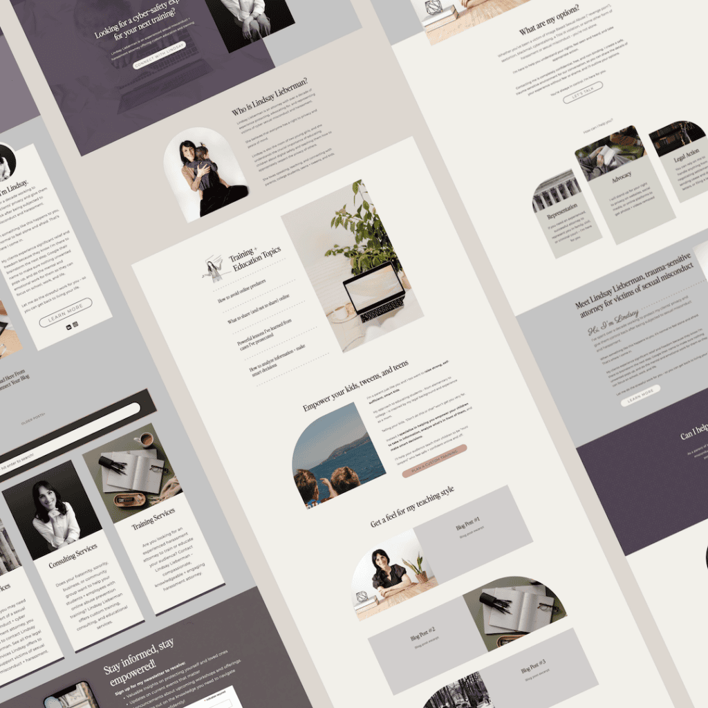
That led us toward an editorial aesthetic layered with custom illustrations, timeless typography, muted color, and thoughtful details that feel established without feeling intimidating. The result is a brand that’s unmistakably professional while still feeling welcoming and deeply personal.

“Stephanie provided tons of guidance, insight, and creative designs and inspiration for me to figure out exactly what I wanted.”
The Creative Direction
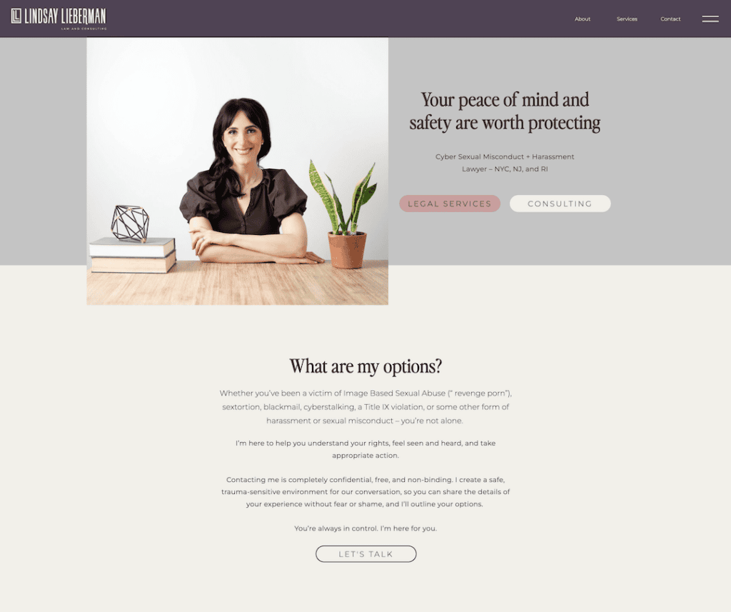
For Lindsay, the goal was never to create a brand that simply looked like a law firm. It needed to feel calm, intelligent, welcoming, and deeply trustworthy without borrowing the familiar visual language of a traditional practice.
That realization changed where we looked for inspiration. The more we explored traditional legal branding, the less it felt like Lindsay. So instead of borrowing from other attorneys, we started collecting references that reflected the experience she creates for her clients.
Those influences became the foundation for every creative decision that followed.

Muted, calming colors soften the overall experience while elegant typography reinforces skill and character. Hand-drawn illustrations, custom textures, heritage-inspired crests, and thoughtful framing details add warmth and personality without distracting from the work itself. Every element reinforces the same story: a law firm that’s deeply knowledgeable, genuinely compassionate, and unlike anything else in its niche.
This is what creative direction is. It’s the bridge between strategy and design—the process of translating someone’s personality, values, and vision into a visual experience that feels unmistakably theirs. I often describe it as the north star of a brand because it keeps every decision—from the typography and color palette to the website, photography, illustrations, and printed materials—moving in the same direction. Without it, even beautiful design can feel disconnected. With it, every touchpoint feels like it belongs to the same world.
Bringing the Brand Identity to Life
Once the creative direction was established, every deliverable had a clear purpose.
Instead of designing individual pieces in isolation, we built a complete visual system—from the custom LL monogram and flexible logo suite to the illustration library, brand patterns, typography system, photography direction, and color palette. Each element reinforces the same story, making the brand feel consistent whether someone encounters Lindsay through her website, a presentation, printed materials, or social media.
The result is a brand that feels refined, notable, and distinctly Lindsay.



Law Firm Website Design Strategy
One of the most unique aspects of Lindsay’s practice is her commitment to education.
She isn’t simply representing clients after harm has occurred—she’s actively working to prevent it through workshops, consulting, policy development, and training. That meant her website needed to do far more than list legal services or highlight professional accomplishments.
Many law firm websites make the mistake of trying to appeal to everyone. They overwhelm visitors with legal jargon, bury important information beneath dense blocks of text, or focus so heavily on credentials that they forget the person searching for help on the other side of the screen.
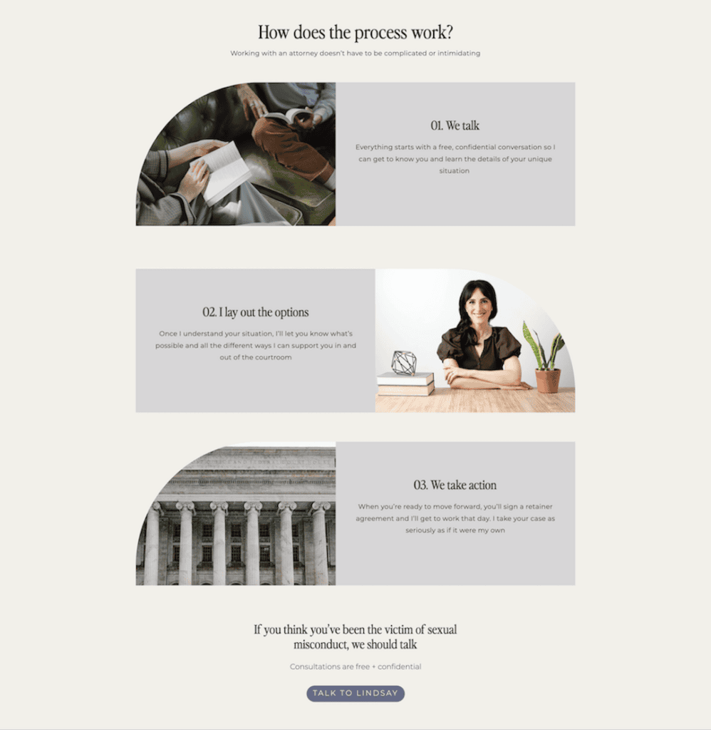
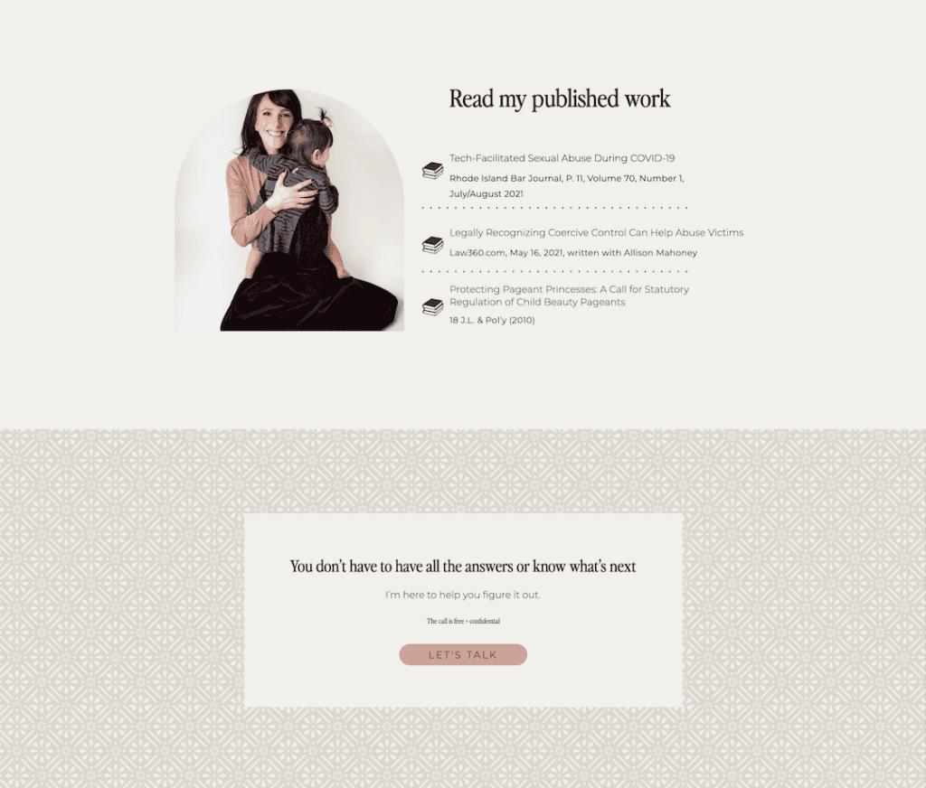
Instead, we designed Lindsay’s website around readability, trust, and education. The site clearly separates her legal services from her consulting work, breaks complex topics into approachable language, and positions her as both an experienced attorney and a trusted educator.

Clean editorial layouts, intuitive navigation, and intentionally curated imagery work together to create an experience that’s easy to navigate while reinforcing credibility. Rather than pushing visitors toward a consultation at every opportunity, the website is designed to answer questions, provide reassurance, and make an overwhelming process feel a little more manageable.
That same philosophy carried through the design process itself. Lindsay later described the experience as having “the perfect guide to a new and overwhelming process,” noting that the clarity and collaboration helped her discover what she wanted her brand to become.
The Final Result
The finished brand reflects the same balance Lindsay brings to every aspect of her work. It communicates authority without intimidation, compassion without sacrificing professionalism, and expertise without relying on legal clichés. The result is a visual identity that’s every bit as thoughtful, nuanced, and built to earn trust in a way that feels true to who she is.
Looking back on the project, Lindsay shared:
“I had a wonderful experience working with Stephanie, who graciously held my hand and walked me through each and every step of the process… I love the finished product!”



What Makes Great Law Firm Branding?
One of the biggest misconceptions about legal branding is that professionalism and personality exist on opposite ends of the spectrum. They don’t.
For years, attorneys have been taught to strip away anything that feels too personal in an effort to appear more credible. But in a world where AI can generate websites, write content, and imitate expertise in seconds, the qualities that actually make someone memorable are the ones technology can’t replicate.

Your story. Your perspective. The way you care for your clients. The experiences that shaped your practice. The interests, values, and personality that influence how you show up every day.
Those are the things people connect with. They want to understand what you believe, how you approach your work, and whether they can picture themselves sitting across the table from you.
Lindsay’s brand is proof that a law firm can feel deeply professional while still making room for humanity. Because at the end of the day, people aren’t just hiring legal expertise—they’re trusting another person with one of the hardest moments of their lives.
Looking for a Law Firm Brand & Website That Reflects the Way You Practice?
I believe the future of professional branding belongs to businesses that are willing to be remembered for more than their credentials. As AI continues to make expertise easier to imitate, the qualities that truly set us apart become even more valuable.
People are craving real connection, and that doesn’t stop when they’re looking for an attorney, therapist, accountant, or financial advisor. They want to know who they’re trusting, what you believe, and why you do the work you do.
The details that make you different—your history, your values, your interests, and the way you care for your clients—aren’t distractions from your professionalism. They’re becoming some of your greatest assets.
If you’re ready for a brand and website that capture the story only you can tell, I’d love to hear yours.
Some links on this page may be affiliate links. I only recommend tools I personally use and trust.

Website Planning 101

These resources are pulled directly from the same materials and frameworks I use with my clients — designed to help you think through your brand and website with more clarity and intention. Consider this a behind-the-scenes look at how I approach the work.
A peek inside my process
From the Studio Library

I create thoughtful brand identities and custom Showit
websites designed to bring clarity, cohesion, and direction to your business — so everything finally feels like it fits.
I’ve worked with businesses across a wide range of
industries, but the goal is always the same: build something intentional, aligned, and bookable.
And yes… it gets to look really good too.
