

How to Simplify Your Website Content Without Losing Impact

If you’ve ever tried to write your own website copy and suddenly realized you were six paragraphs deep with no clear point in sight… this one’s for you.
I see this all the time with business owners who grew up in the old website era — when long pages, chunky paragraphs, and text-heavy layouts were considered “thorough.” Back then, readers might have been willing to sit and sift through your thoughts. Today? You’ve got about two seconds to hook someone before they scroll, skim, or bounce.
The good news is that simplifying your website doesn’t mean watering it down.
In fact, clarity is what makes your brand more beautiful and more bookable.
A strategic, simplified website helps your visitors instantly understand who you are, what you do, and what they should do next — no digging, deciphering, or detective work required.
Let’s walk through how to simplify your website without losing impact, personality, or depth.
Why “Essay-Style Websites” Don’t Convert Anymore
If your website reads like a novel, your reader becomes the editor… and editors get tired fast.
People don’t read websites line by line. They scan. They glance at headlines. They look for visual anchors. They want quick clarity.
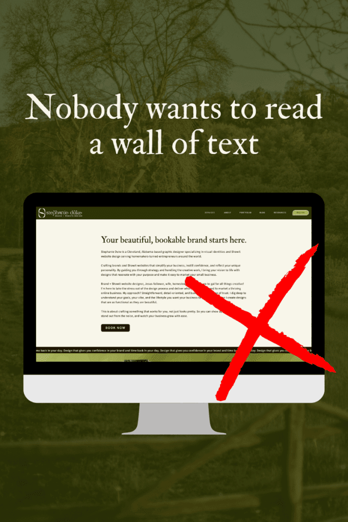
The problem with long, heavy paragraphs is your message gets buried and your visitor bounces before seeing what makes your brand the best fit. A beautiful, bookable brand doesn’t overwhelm. It guides. It communicates quickly. It builds momentum section by section.

When your messaging is focused and punchy, you make it easy for someone to say “Yep, this is exactly what I need.”
Break Your Website Down Into Purpose-Driven Pages
A simplified website isn’t necessarily a smaller website — it’s a strategic one.
Every page has a job. Every section has a purpose. Every word has a reason to exist.
Here’s how to think about it:
Home Page → First Impression + Direction
This page should answer:
- Who you are
- Who you help
- What you do
- Where they should go next
It’s a quick overview, not a deep dive.
About Page → Connection + Credibility
Not your life story, just the story that matters to your clients. Tie your experience back to their needs.
Services Page → Clarity + Structure
Break each offer into bite-sized pieces:
- What it is
- Who it’s for
- Why it matters
- What’s included
- Pricing (even if it’s just to say you’ll custom quote them on a call)
- Clear next step
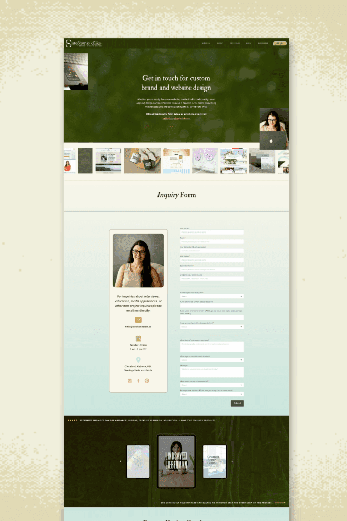
Contact Page → Low-Pressure Invitation
Simple. Friendly. Barrier-free. Make it dummy proof so they have no reason not to reach out.
Optional Pages → Only if they serve a purpose
Portfolio, Blog, Locations, Shop pages, etc.
When each page has one clear function, the whole website becomes easier to navigate, understand, and trust.
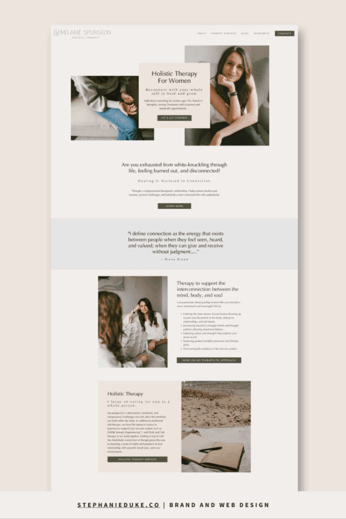
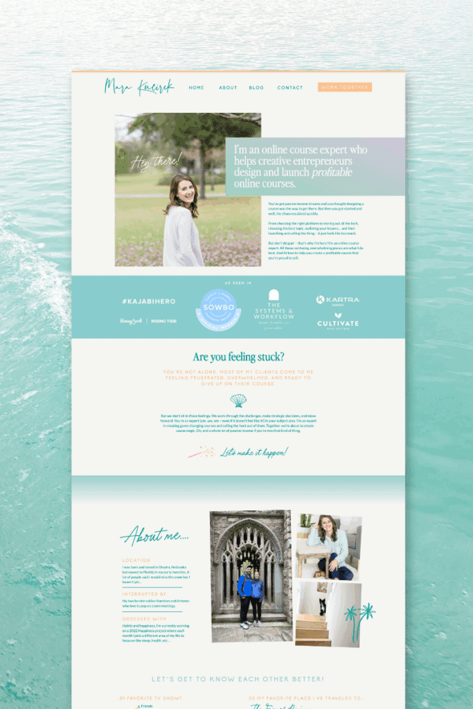
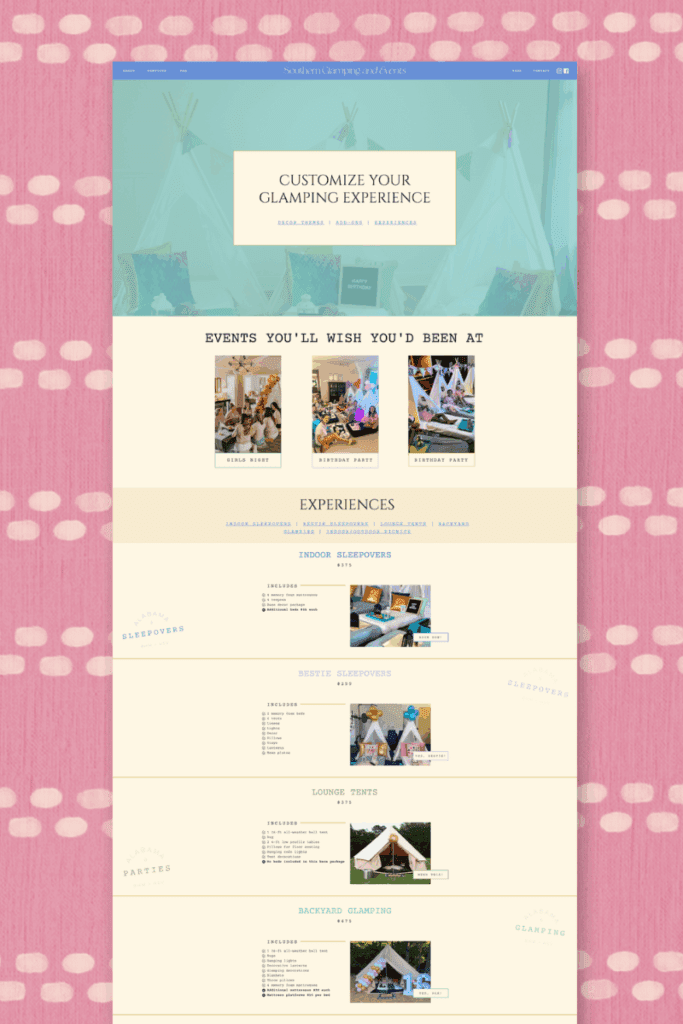
Each Page Gets Broken Into Sections (Not Paragraphs)
This is where people get stuck. They write all the ideas first… Then try to shove it into a huge wall of text.
Instead, use the following as a loose template for each main point on the page:
- Headline: the promise
- Subheadline: a supporting line
- Short paragraph or bullet points: the details
- Visual element: photo, illustration, or graphic
- CTA (call to action): the next step
That formula keeps your content scannable and your visuals intentional — the foundation of a beautiful, bookable brand.
Keep Your Navigation Simple (Seriously.)
If your website menu looks like a Cheesecake Factory menu, we need to talk. Simple, clear navigation is one of the fastest ways to improve usability and reduce overwhelm.
Aim for 6–8 main menu items max.
Common main navigation links:
- Home
- About
- Services
- Portfolio
- Blog
- Contact
What belongs in the footer instead:
- FAQs
- Policies
- Legal pages
- Privacy
- Terms
- Press
- Affiliate info
What does not need its own menu item:
- Every single blog category
- Every freebie
- Every landing page
- Every resource page
All your blog posts belong on your main “Blog” page, not as a mega menu with 25+ subpages. Simplifying navigation makes your brand look more professional and helps visitors take action faster. And if you want your brand to be bookable, that’s the goal.
My Website Planning Guide Will Help You Do This
If mapping out your website feels overwhelming — or you’re already overthinking it — this is your sign to slow down and strategize before you design.
Inside the guide, you’ll learn how to:
- Clarify the real goal of your website (and what you want visitors to do)
- Decide which pages actually matter for your business
- Break each page into clear, intentional sections
- Organize your content so it’s easy to skim and easy to understand
- Stop over-explaining and start communicating with confidence
This isn’t about adding more content. It’s about using the right content in the right places so your website can do its job, even when you’re offline.
If you want a website that feels lighter to manage and stronger at converting, this is the place to start.
👉 Download it for free: www.stephanieduke.co/website-planning-guide
Your website doesn’t need to say everything. It just needs to say the right things, in the right order, for the right people.
That’s how you build a website that looks beautiful, reads beautifully, and most importantly, books.


I’m Stephanie, but you can call me Steph!
I design brands & websites that get you butterflies-in-your-stomach-excited about your business again.
Simply put, I’m a graphic designer that specializes in brand identity design and Showit website design - arguably the most important aspects of your business! I live in central Alabama with my high school band directing hubby, Thomas, on our modest homestead in the country.

Design that gives you confidence in your brand and time back in your day. Design that gives you confidence in your brand and time back in your day. Design that gives you confidence in your brand and time back in your day. Design that gives you confidence in your brand and time back in your day. Design that gives you confidence in your brand and time back in your day. Design that gives you confidence in your brand and time back in your day. Design that gives you confidence in your brand and time back in your day. Design that gives you confidence in your brand and time back in your day. Design that gives you confidence in your brand and time back in your day. Design that gives you confidence in your brand and time back in your day. Design that gives you confidence in your brand and time back in your day. Design that gives you confidence in your brand and time back in your day. Design that gives you confidence in your brand and time back in your day. Design that gives you confidence in your brand and time back in your day.


your guide to a stress-free website
FREE Website Planning Tool
- My exact Website Copy Planner Google Doc
- A master doc for keeping track of links and embed codes
- Loads of tips and tricks for planning website content (copy, photos, branding, etc) with ease
