


If you’ve been in business for a minute you know that owning your own content is vitally important to the long-term health of your business. Social media is just borrowed land that can be taken from you for any reason. Don’t get me wrong, social media is important for promoting your business nowadays, but it is not the saving grace that some people make it out to be. Owning your own content online is far superior. So where do you even own your own content? You own your content in your email marketing, your podcast, and your website.
In today’s episode, I’ll talk about the latter. Having a strong online presence is essential for any business owner, but especially for service providers. Your website is often the first point of contact with potential clients, and it can make or break their decision to work with you. Websites give your business immediate credibility with potential clients, a place to host your marketing content such as blog posts, videos, podcasts, photo galleries, and more, as well as a place for clients to securely book appointments and pay invoices with you. There’s really no downside to owning your own website unless you simply don’t manage it well. A website can be your most valuable asset or it can be the thing that turns potential clients away from you. I want your website to be a valuable asset to your business so today I’m going to cover 7 mistakes I constantly see business owners making on their websites. Hopefully, you aren’t making these mistakes, but if you are, I’ll give you some tips to correct them quickly. Alright, you ready to dive in? Let’s go!
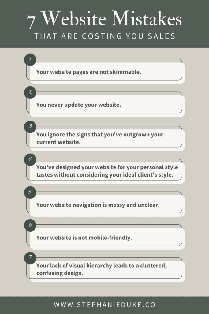
Mistake #1: Your website pages are not skimmable.
When it comes to website content, less is often more. Visitors should be able to quickly scan a page and understand what it’s about without having to read through large blocks of text. When there’s too much text on a page, visitors are likely to get overwhelmed and just leave the site altogether. This mistake can be even more significant for visitors who are using mobile devices, as large blocks of text can be especially hard to read on smaller screens.
In addition to using large blocks of text, another issue that contributes to poor readability is including irrelevant details in your copywriting. When visitors come to a website, they want to find the information they need quickly and easily. They’re not interested in reading about every detail of a product or service if it’s not relevant to their needs, especially if it’s their first time visiting your website. So, when creating website copy, it’s important to focus on the most important information and present it in a way that’s easy to understand and digest. This will not only improve readability but also keep visitors on your site longer and increase the chances of them taking action.
You can create a skimmable web page by breaking up your content into smaller chunks. Here are some more specific tips to achieve this:
- Use headings and subheadings to organize your content and make it easy for readers to scan. Use larger font sizes for your headings and subheadings to make them stand out from paragraph text. Make sure you use the most relevant keywords that a visitor would be scanning for. Some examples are, “Ready to work together? Start here.”, “3 ways to get the website of your dreams”, “Like free stuff?”
- Use bullet points and numbered lists. These are great ways to break up long paragraphs of text and make it easier to read. It’s also a great way to draw attention to key points.
- Keep your paragraphs short. Long paragraphs can be overwhelming and difficult to read. Some people will just completely glaze over them entirely. Keep your paragraphs short and to the point. Cut out filler words and aim for 2-3 sentences per paragraph.
- Images, graphics, and videos can break up large blocks of text and make your web pages more engaging. Use relevant imagery that helps create the vibe you’re going for or illustrates a point.
- Use white space. This is simply empty areas around text or imagery. It helps your content to breathe and makes it easier to consume. It’s much more visually appealing.
- Pay attention to your layout. Don’t just have section after section of an image next to a heading and a paragraph. Break it up and give it some variety. Do an image as the background with a bold heading followed by an image on the right with a few bullet points on the left followed by 3 boxes with headings and subheadings. Make sure the layout makes sense for your content, but don’t get stuck using the same layout for every section of your site.
Mistake #2: You never update your website.
Oof, this is a big one. Google considers outdated websites to be dead and therefore bumps them down significantly on search rankings. If you have outdated content, such as blog posts or promotions from years ago, it can also signal to visitors that your website is not a reliable source of information. This hurts your credibility and reputation. It can signal to visitors that you are not actively maintaining your website, which may make them question whether your business is still operational. This is especially true if you have promotions or deals advertised on your website that have already expired. Visitors who see those outdated promotions may be deterred from engaging with your business or making a purchase at all, which can result in lost sales.
The copyright in the footer of your website is also an important detail to keep up to date. It shows that your website is current and that you take your business seriously.
No new content is another sign of neglect, so it’s important to keep your website fresh with new blog posts, podcasts, pages, or page updates. Do something! Consistent updates will also signal to search engines that your website is active and relevant, which can improve your search engine rankings and help you attract new clients.
An easy way to consistently update your website is to make a blogging schedule. You don’t have to publish blog posts weekly, no, even just once a month is enough to tell search engines that you are still making relevant content. Blogging is awesome for SEO in general so I highly recommend it. It’s a simple way to show visitors you know what you’re talking about.
Mistake #3: You ignore the signs that you’ve outgrown your current website.
If you’re not getting ideal leads or booking higher-paying clients, it could be a sign that your website is no longer optimized for your target audience. Perhaps your website design, copy, or your branding no longer resonates with your target market or doesn’t reflect the quality and level of service you offer now. If you’ve changed your business model or the focus of your business, your website needs to reflect those changes. An outdated website that does not align with your current business strategy could deter potential clients and negatively impact your brand image.
If it’s been more than five years since you refreshed your website design, it’s definitely time to reassess whether it still reflects your brand and serves your current business goals. Consistent branding across all your marketing efforts, including your website, YouTube channel, and social media, is essential. Inconsistent branding can create confusion and make potential clients question whether they’re even on the right website.
Even just refreshing your website can provide an opportunity to implement new technologies and features that enhance user experience, streamline processes, and improve your search engine rankings. Overall, neglecting to update your website can be detrimental to your business’s growth and success.
Mistake #4: You’ve designed your website for your personal style tastes without considering your ideal client’s style.
Designing a website based solely on personal preferences rather than considering the preferences of your ideal client is a common mistake that can result in a lack of engagement and trust with potential customers. Your website should be tailored to meet the needs of your target audience, rather than being solely a reflection of your own aesthetic preferences. For example, you may love complex, Victorian-type-inspired designs, but if your ideal client is an aging grandmother that’s 65+ then she may require a bolder, easier-to-read sans-serif font choice.
This doesn’t mean your website shouldn’t reflect your personality at all, especially if your business is rooted in your personal brand. However, to avoid this mistake, it’s important to conduct research and understand the preferences and behaviors of your ideal clients. This can be done through surveys, feedback forms, Instagram Story polls, or analyzing your website’s analytics.
By considering your ideal client’s style and preferences in your website design, you can create a more effective and engaging website that resonates with your target audience and therefore keeps them on your site longer. The key is to find a balance between your personal style and that of your ideal client so that both you and your audience are happy with the final result. I always say the magic happens when you and your ideal client BOTH love your brand.
Mistake #5: Your website navigation is messy and unclear.
If you’re unfamiliar with website terminology, your navigation is simply the menu with options like Home, About, Contact, Blog, etc. Having a clear and easy-to-use website navigation is crucial for providing a positive user experience. If your navigation is cluttered with too many options or uses vague or “cutesy” language that your ideal client may not understand, it can cause frustration and confusion, ultimately driving potential clients away from your site.
To avoid this mistake, consider simplifying your navigation by categorizing your pages into broad topics and limiting the number of pages in your main navigation. Use clear and concise language that your ideal client will understand and avoid using industry jargon or buzzwords that may be unfamiliar to them. Also, consider placing your navigation in a common and easy-to-find area of your website, such as the header or sidebar. By making it easy for visitors to find the information they need, you can increase engagement and conversion rates on your website.
I would suggest limiting your main navigation to no more than 8 options. In most cases I believe including the Home button is irrelevant because most website visitors know you can click the logo in the header to go to the home page. So here are some examples:
- If you’re a chiropractor or therapist I would include About, Services, Patient Portal, Contact, Blog, and Locations.
- If you’re an online business coach I would include About, Services, Blog, Contact, Podcast (if applicable), Resources, and Student Login if you have online courses.
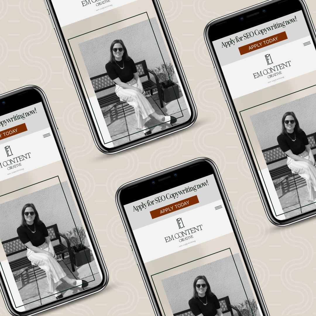
Mistake #6: Your website is not mobile-friendly.
According to Oberlo.com, as of February 2023, 52.08% of total web visits are done on mobile devices. This means you should always, always be designing your website with mobile in mind! If your website is not optimized for mobile, it can lead to a poor user experience for visitors trying to access it from their phones or tablets. One of the common issues with non-mobile-friendly websites is that the content may not adjust to fit the screen size, leading to text or images being cut off or overlapping. This can make it difficult for users to read and find what they’re looking for, leading to frustration and ultimately causing them to leave your website.
This is why I absolutely LOVE Showit as my website builder. Unlike most traditional website builders, you can edit the mobile and desktop versions of your site completely separately from one another. The mobile editing screen even shows your site mocked up with a phone so you can see exactly how it will appear once it’s live. You can rearrange elements, hide elements, change colors and additional features and so much more on mobile without affecting the layout of desktop or vice versa. This makes it incredibly easy to create stunning, SEO-friendly mobile websites.
Not having a mobile-friendly website can also negatively impact your search engine rankings. Google, for example, favors mobile-friendly websites and has even implemented mobile-first indexing, meaning that it primarily uses the mobile version of a website to determine its search engine ranking. If your website is not optimized for mobile, it may not appear as high in search results as other websites that prioritize mobile design, making it harder for potential customers to find your business organically.
Mistake #7: Your lack of visual hierarchy leads to a cluttered, confusing design.
Visual hierarchy refers to the arrangement of design elements in a way that creates a clear and logical structure, which guides the viewer’s attention to the most important information first. When a website lacks visual hierarchy, it can lead to a crowded, and disorganized design that overwhelms visitors and makes it difficult for them to find what they’re looking for.
One common mistake is to have too many design elements on a single page, such as large blocks of text, multiple headings, images, videos, and other graphic elements. This can make the page feel chaotic, and users may struggle to determine where to focus their attention.
Another common error is using too many different fonts or colors, which can make the page look unprofessional and difficult to read. It’s best to limit the number of fonts to no more than 3 and colors to no more than 3 or 4 main colors alongside some neutrals and use them consistently throughout the website.
Important information should also be given prominence through your visual hierarchy. This means making sure that key information, such as calls to action or important messages, are given more visual weight than less important elements. For example, important headings should be larger and bolder than subheadings, and buttons that lead to important actions should stand out with a different color or shape and be consistent throughout the entire website.
Overall, a clear and logical visual hierarchy can improve the user experience on your website, helping visitors find what they need quickly and easily, and ultimately, leading to more conversions and better engagement.
In conclusion, having a website that represents your business and brand well is essential in today’s digital age. However, avoiding the common mistakes discussed in this episode is equally important. Your website should be skimmable, up-to-date, mobile-friendly, and designed with your ideal client in mind. The layout, navigation, and visual hierarchy should be clean and uncluttered, with a clear call-to-action and easy-to-use contact forms.
So by addressing these mistakes, you can significantly improve your website’s user experience, build trust with potential clients, and likely increase conversions. Remember, your website is often the first impression you make on potential customers, so investing time and effort in creating a high-quality website is essential to your brand’s success. Use the tips provided in this episode to improve your website and take your business to the next level.
If you’re ready for help up-leveling your website, I offer both custom Showit website design services and template customization services. I’ll leave some links for both in the show notes so you can check out the details. I hope this episode was super helpful and got your wheels turning on ways to improve your website.
If you’re loving the Homemakers in Business podcast and want to hear more branding, website, marketing, and entrepreneurship advice I’d encourage you to leave a 5-star review on Apple Podcasts. Reviews are the main way new shows get pushed out and I am eager to continue growing this show and the community around it! You can find me on my website stephanieduke.co and on Instagram/Facebook with the same handle, @stephanieduke.co. All this information will be in the show notes as well. Thank you so much for tuning in. Seeya next time!
Some links on this page may be affiliate links. I only recommend tools I personally use and trust.

Website Planning 101

These resources are pulled directly from the same materials and frameworks I use with my clients — designed to help you think through your brand and website with more clarity and intention. Consider this a behind-the-scenes look at how I approach the work.
A peek inside my process
From the Studio Library

I create thoughtful brand identities and custom Showit
websites designed to bring clarity, cohesion, and direction to your business — so everything finally feels like it fits.
I’ve worked with businesses across a wide range of
industries, but the goal is always the same: build something intentional, aligned, and bookable.
And yes… it gets to look really good too.
