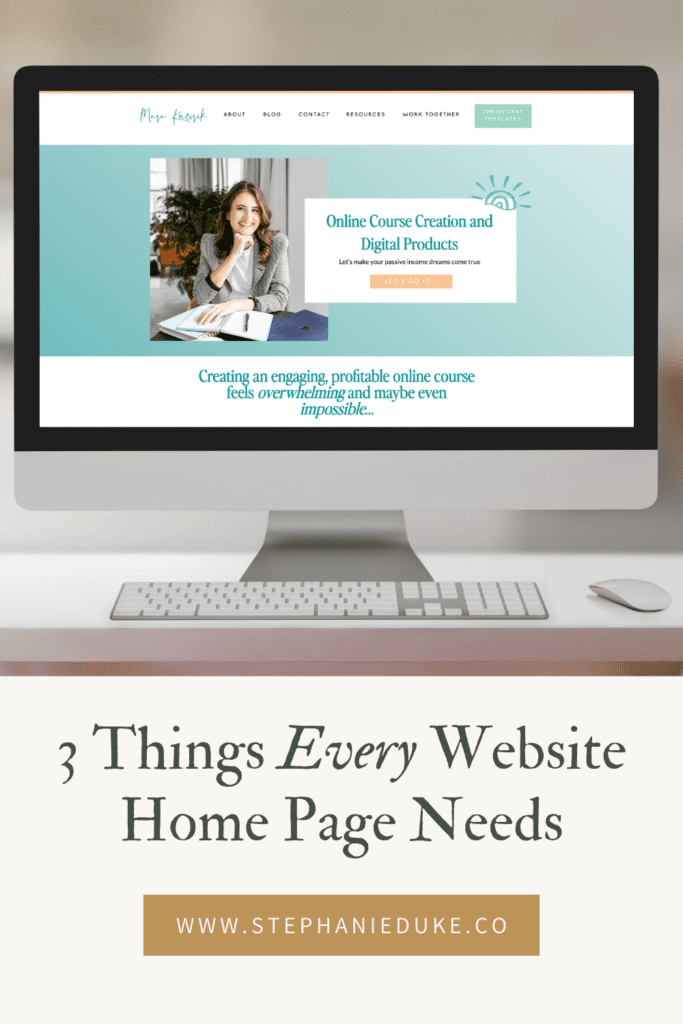
3 Things Every Website Home Page Needs
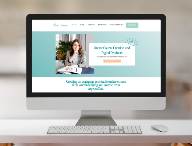
These are 3 things I truly believe every website homepage should have regardless of what you’re selling. Whether you’re an artist selling jewelry or paintings, an educator selling courses, or a copywriter selling services, your homepage should have these 3 elements. I have quite a few more things I could have added to this list, but I wanted this episode to be short and actionable, and not overwhelming. So, without further ado, here they are:
Clear navigation
First, let’s define exactly what I mean by navigation. For this example, I simply mean your menus. The bar menu or dropdown menu at the very top of a webpage and at the bottom (also known as the footer) of a webpage. You can have many other types of navigation and menus, but these are the 2 primary navigation areas I’m talking about today. Okay, now let’s get into it.
Your website is basically a guide, and a good guide gives clear instructions. Imagine you’ve been given a guide to a city you’ve never visited. You’re trying to information on the local art museum, but the words “art museum” are nowhere to be found. Instead, they use cutesy language like “Painter’s Place.” Most people aren’t going to understand what that is, or they’ll at least question if it’s what they’re looking for. The same goes for your website. Instead of “Journal,” say “Blog.” Instead of “The Story”, say “About.” Instead of “Let’s Go”, say “Contact” or “Book.” Drop the cutesy language and just be clear. Website navigation is so important, you don’t want to cause any unnecessary confusion with your potential clients or customers.


Your navigation should be visually simple and intuitive. Don’t try to over-design this part of your website. There’s plenty of room for interesting design choices on the pages of your website, but your menus should be free of clutter and designed in a familiar way. A simple bar across the top or a drop-down hamburger menu in the corner is good enough. I don’t recommend being clever with your menu design.
Also, I’ve mentioned this in a previous episode, but be sure to keep your menu options short. No more than 8 links is preferred. And you don’t need an exclusive “Home” button. Simply making your logo link back to the home page is enough because most users expect the logo to take you to the homepage. The most common menu buttons are: About, Contact, Blog, Shop, and Services. Most users understand what all of these options entail so it makes it easy for them to understand your navigation quickly.
Calls to action
Also called CTAs, getting users to click on a call to action button is almost the entire point of a website. If you’re unfamiliar with this terminology, some examples of CTA buttons are “Contact Us,” “Book Now,” or “Sign Me Up.” Unlike menu navigation, your CTAs can be a little more creative. In fact, for the purpose of analyzing your website’s conversions, each page should have uniquely named buttons. This will help you with where on the page and on what verbiage a user is most likely to click. For example, if you have an online shop you don’t want to use the CTA “Shop Now” multiple times on the same page. Instead, use variations of the phrase to encourage engagement. Shop Now, Shop, Let’s Shop, Shop the Goods… You get the point.
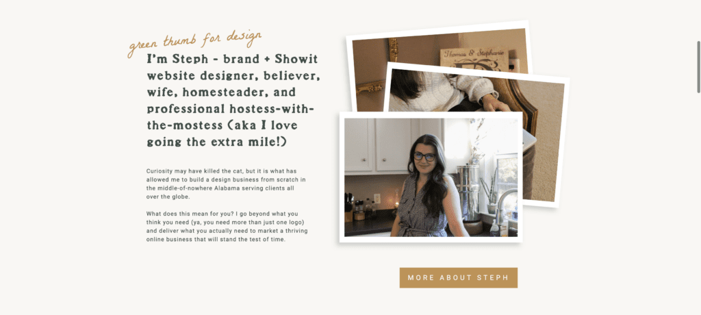
A fun tool for coming up with a variety of CTA phrases is ChaptGPT or another AI system. Based on your prompt, you can get some responses that are super specific to your niche.
Now, while CTAs are clearly super important for website engagement and conversions, you don’t want to overdo it. If you can imagine your website broken down into sections, such as your header, about section, services overview, email opt-in, etc. you don’t want a CTA more than every 2-3 sections. Because while yes, your website is there to sell visitors on your site, you don’t want to bombard them with too many buttons. This can feel overwhelming and salesy to your potential customers.
My last comment for CTAs is to make the button color, shape, and size consistent across your website. Make it a color that stands out from all the other colors on your website. For example, on my site, all of my primary CTA buttons are gold. Most of my background colors are neutrals or pale green so it stands out well. By keeping this consistency, you’re actually training your visitors to know where to click. They don’t have to work harder to find your buttons. They start to stick out to them after a few minutes of browsing your site if you’ve done this well.
Hero section
The hero section is simply the first section someone sees when visiting a page on your website. It doesn’t matter if it’s the homepage, the About page, or the Services page. The hero section is always the first section you see on a webpage. The only exception may be a blog post or contact page, depending on the design. It’s what is visible when a webpage first loads without you having to scroll any. For this reason, it’s a very important section. And for the sake of simplicity, I’m just going to talk about the hero section of your homepage.
When someone lands on your website for the first time, be it from a Google search or social media, they need to know right off the bat if they are in the right place. There should be no disconnect between what they saw that made them click over to your website and what they see in that hero section. So what might cause a disconnect? Primarily inconsistent branding or messaging will cause confusion. If you are using different colors, fonts, or images than they’ve seen of your brand in other places, or if your messaging (literally the words on the screen) doesn’t match the tone of what they’ve previously read or heard from you.
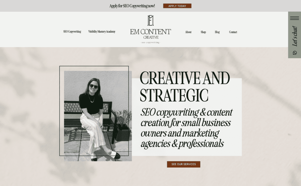
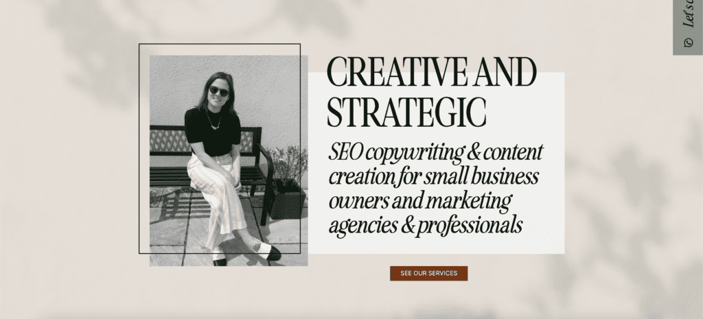
Okay, so how can you create an optimized hero section? As far as messaging goes, you want to include who you are, what you do, and who you serve in a concise way. No more than 2 sentences is ideal, but it truly depends on your brand. Now, you don’t have to make it sterile, like “Hi, my name is Stephanie. I’m a brand and website designer. I serve legacy-minded homemakers in business.” Mine currently says, “Timeless brands and website.” as the main title and, “Cultivating lovely, functional brands + Showit websites for legacy-minded homemakers in business.” as the heading. Use your font hierarchy to your advantage to make it easy and fun to read. It should get the point across in as few words as possible just so new visitors know they’re in the right place.
As far as the design, there are a million different things you can do. If you’re a personal brand, it’s a good idea to include a photo of yourself. If you’re a shop, showcase your best-sellers or highlight a sale you’re promoting. You can use video, slideshows, GIFs, or subtle page animations to make it more visually engaging. However you design it, just make it clear to new visitors who you are, what you do, and who you serve. You don’t want them to have to go searching for that information when it should be readily available to them when they land on this page.
In Conclusion
Like I said at the beginning of this episode, there are several other elements I could have added to this list, but I didn’t want to overwhelm you with too much information in one episode. I do believe these 3 components lay a good foundation for a seamless user experience that’ll guide your visitors to take your desired actions. By providing easy navigation, attractive CTA buttons, and a visually stunning hero section, you’ll be ensuring that your website is more engaging and directs your potential clients where they want to go with ease. So, take the time to scan your own website for improvements you can make based on these 3 tips, and watch your website become the powerful tool you’ve always wanted it to be! If you have any questions regarding your website, please feel free to DM me on Instagram. Seriously, I’m always happy to chat with you!
I’m Stephanie, but you can call me Steph!
I design brands & websites that get you butterflies-in-your-stomach-excited about your business again.
Simply put, I’m a graphic designer that specializes in brand identity design and Showit website design - arguably the most important aspects of your business! I live in central Alabama with my high school band directing hubby, Thomas, on our modest homestead in the country.
Design that gives you confidence in your brand and time back in your day. Design that gives you confidence in your brand and time back in your day. Design that gives you confidence in your brand and time back in your day. Design that gives you confidence in your brand and time back in your day. Design that gives you confidence in your brand and time back in your day. Design that gives you confidence in your brand and time back in your day. Design that gives you confidence in your brand and time back in your day. Design that gives you confidence in your brand and time back in your day. Design that gives you confidence in your brand and time back in your day. Design that gives you confidence in your brand and time back in your day. Design that gives you confidence in your brand and time back in your day. Design that gives you confidence in your brand and time back in your day. Design that gives you confidence in your brand and time back in your day. Design that gives you confidence in your brand and time back in your day.
your guide to a stress-free website
FREE Website Planning Tool
- My exact Website Copy Planner Google Doc
- A master doc for keeping track of links and embed codes
- Loads of tips and tricks for planning website content (copy, photos, branding, etc) with ease
