

Why the Pensacola Rebrand Works and Florence’s Didn’t
If you’ve been anywhere near Facebook lately (bless), you may have seen the reaction to the recent rebrand from the City of Pensacola.
And whew. People feel some type of way.
Every time a city rebrands, the internet does what it does best: panics, argues, and declares the logo “boring” and a waste of tax dollars.
As a brand designer and as someone who has been visiting Pensacola for nearly three decades, I’ve been watching the conversation closely. And while I understand the emotion behind the comments, I think the rebrand itself is genuinely well done.
This conversation hits close to home for me because I live in Alabama, and a few years ago, Florence, Alabama rolled out a city rebrand that… well… let’s just say it did not go over well at all. The backlash was so loud it even made it to top creative outlets like Creative Bloq.
If you’ve seen the City of Pensacola‘s rebrand, you’ve probably also seen the comment section meltdown.
“It doesn’t represent us.”
“They should’ve asked the people.”
“Why doesn’t it show the beach / lighthouse / military / everything all at once?”
Listen, I get why people feel emotional about it. A city isn’t just a product. It’s home.
And because I get that, today I want to talk about why this rebrand actually works and why Florence’s… didn’t (to put it quite kindly).
Because city branding isn’t about being literal. And it definitely isn’t about taking a mass vote.
So today, I want to touch on:
- Why city branding causes big feelings
- Why “asking the public” sounds good in theory but breaks down in practice
- The difference between literal and symbolic logos
- And why Pensacola’s rebrand works, especially for a tourist-driven city
Why City Branding Feels So Personal
A city brand isn’t just a logo. It represents:
- Home
- Identity
- Memory
- Pride
- Belonging
- History
That’s a lot of emotional weight to place on a single visual system.
So when people see something change, especially something they didn’t personally approve, it can feel like something is being taken from them, even if the intent is positive.
That emotional reaction is valid.
However, strong emotions alone do not equal effective design strategy. And good design can’t be driven solely by nostalgia or personal attachment to specific landmarks, colors, or symbols.
Cities aren’t branding themselves for who they were 30 years ago. They’re branding themselves for who they need to be next.
Why You Can’t Ask 50,000 People to Design a Logo
In theory, public input sounds inclusive and fair. In practice, if you ask 50,000 residents what a city’s logo should look like, you’ll get:
- 50,000 opinions
- 50,000 emotional attachments
- 50,000 competing visions
And zero clarity.
Strong branding, especially civic branding, requires a small, trusted group of decision-makers who:
- understand long-term goals
- represent multiple perspectives
- can separate personal preference from strategic need
The more voices you add, the more diluted the message becomes. Design thrives on clarity.
And to be clear, city officials aren’t immune to this problem either. Even within a small group of 5–10 decision-makers, the desire to keep everyone comfortable often leads to approving the safest option possible.
This unfortunately can mean a logo devoid of much personality. But “safe” does not automatically mean “bad.”
In many cases, safe means functional, scalable, and future-proof.
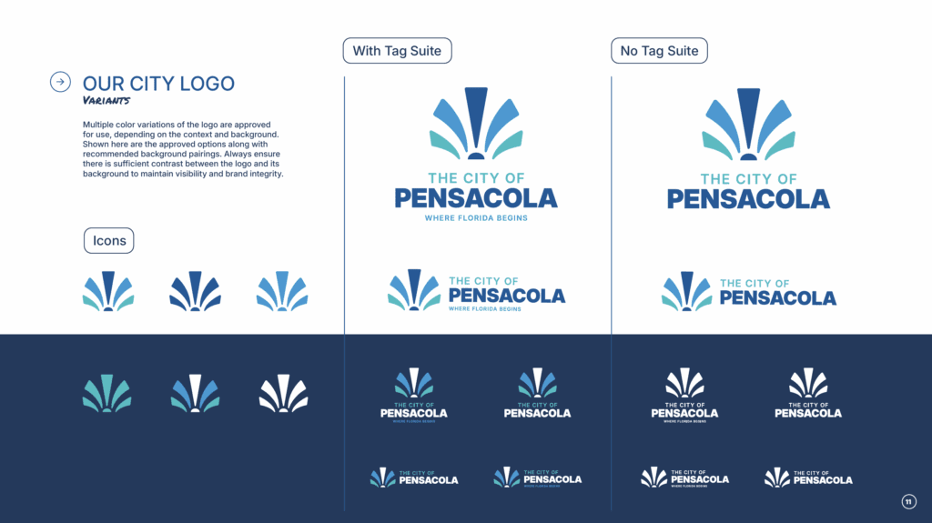
Literal Logos vs. Symbolic Logos (Where People Get Stuck)
One of the most common critiques of the Pensacola rebrand I’ve seen is:
“It doesn’t show the beaches / lighthouse / five flags / military / Blue Angels / history.”
While I love to design logos with meaning and fun hidden Easter eggs, what non-designers tend to get hung up on is the lack of explicit details in logos. But please hear this:
Logos are not illustrations.
They’re symbols meant to easily identify a place, product, business, or person. If logos had to be literal, Apple would be… what? A desktop computer? A phone? A keyboard?
Apple’s logo has absolutely nothing to do with what the company does. And yet people will fiercely defend that brand. Why is that?
It’s because people don’t love logos. They love how being part of the brand makes them feel.
Apple vs Android isn’t about the logo—it’s about identity and community.
The same principle applies to cities. People have strong emotional attachments to the place they call home (obviously) and want to see the pieces they consider important to be represented in the logo.
This is why cities and businesses alike don’t invest in just a logo. They invest in a visual brand identity system. The system tells the whole story. A logo is simply one piece of the puzzle.
What the Pensacola Rebrand Gets Right
Yes, the caption announcing the rebrand was clearly AI-written and that part is… not great. In fact, the talk around AI in the comments sections is a topic for its own article.
But the brand system itself? Thoughtful. Strategic. Easily recognizable. Built for longevity.
Here’s why it works.
1. It’s Designed for a Digital-First World
Cities, like businesses, live online now:
- tourism websites
- mobile maps
- event promotions
- social media
- wayfinding systems
This identity scales cleanly across all of it without falling apart or feeling dated.
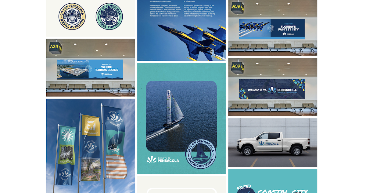
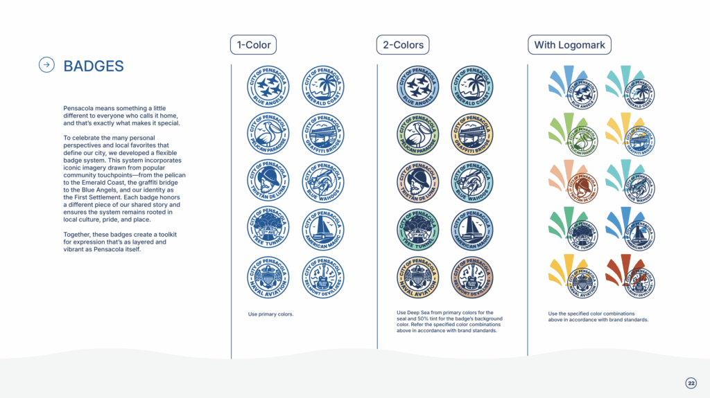
2. The Logomark Lets Pensacola Speak for Itself
This is one of my favorite design decisions.
Instead of the logomark trying to say everything, the system allows for real imagery to live inside the mark:
- beaches
- neighborhoods
- events
- people
The city becomes the hero, not the graphic. Isn’t that what the people want?
3. The Color Palette Feels Like Pensacola
As someone who’s been visiting for nearly three decades, this palette feels right.
We could argue for days about if the exact shades of blue are the best representation of P’cola. But the reality is, if you steered away from a blues based palette for a beach-driven tourist city, people would lose their minds.
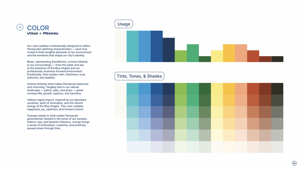
This visual identity relies more heavily on supporting graphics like patterns, icons, badges, photography, and other design elements to tell the Pensacola story.
The color palette in this case simply supports those elements.
4. Typography That Improves Wayfinding (Yes, This Matters)
This part gets overlooked, but it’s huge.
Clear, simplified typography:
- improves accessibility
- makes navigation easier
- benefits locals and visitors
This is functional city infrastructure. Not just aesthetic for aesthetic sake.
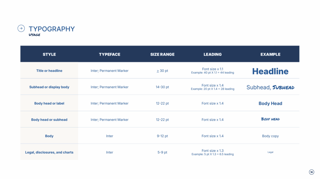
Even the accent font, Permanent Marker, is highly legible at large and small scale sizes.
Florence, Alabama… A Contrast
Now let’s talk about the other side of the coin. When Florence rebranded a few years ago, the result was frankly atrocious.
At first glance it looks like shorthand for something that definitely shouldn’t be associated with a city.
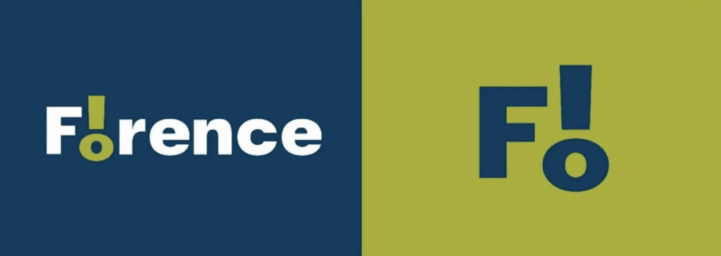
I searched for hours (yes, this is my career so I was interested enough to be invested in this for hours, LOL) for a positive comment about the rebrand. Not one was found.
As a designer, I could see the vision. Simple, modern, built for the digital age much like the Pensacola rebrand goals. The execution, however, was sorely lacking.
As I was not involved in the process, I can’t say for certain what happened in those design meetings that led to this being the final outcome. All I know is that it was a clear miss.
Nothing about the logos, colors, fonts, or additional brand assets addressed anything about what makes Florence special. Just a big F! on a chartreuse backdrop.
Good city branding should still work 10–20 years down the road. This didn’t work for 5 minutes on Facebook.
“They Spent $25,000 on a Logo” (No, They Didn’t)
This one makes visual brand designers everywhere sigh.
That budget didn’t pay for “just a logo.” It paid for:
- research
- strategy
- a full visual identity system
- typography
- iconography
- usage guidelines
- long-term scalability
- real humans’ real brains doing the work
$25,000 for a full rebrand is a modest investment for a city the size of Pensacola. Which brings us to tourism.
The Tourism Reality No One Wants to Talk About
Pensacola is a tourist city. Tourism brought in over $2 billion in 2024.
If the city invests roughly $2 million to roll out a cohesive, functional brand system that:
- Improves visitor experience
- Strengthens recognition
- Supports long-term growth in both physical and digital spaces
That’s not reckless spending. That’s a smart investment in infrastructure and forward planning.
People aren’t (usually) mad about just the logo. They’re mad about change they didn’t control, especially when trust in government is already thin.
How Cities Could Roll Out Rebrands Better
Here’s where I think cities can improve public relations around rebranding. Mind you, this is nowhere near an exhaustive list.
Rebrands are shocking when:
- they happen suddenly
- there’s little education around why
- people don’t understand what they’re actually paying for
Some ways this could be handled better:
- meeting with focus groups to get public opinion before the brand design process begins
- sharing early concept directions publicly (without asking for votes)
- educating residents on what a brand system includes
- creating content in collab with the design studio that show the thought process and creative action
- clearly communicating timelines and long-term benefits
Also worth noting, this is Pensacola’s third rebrand in 16 years. That is a lot.
A strong city rebrand should realistically last 10–15 years minimum.
That said? Of the three, this is by far the strongest.
Design Isn’t About Pleasing Everyone
City branding will always be emotional and controversial.
But the goal isn’t to make everyone happy. It’s to build something:
- functional
- recognizable
- adaptable
- and future-focused
And from someone who deeply loves both Alabama and Pensacola? This rebrand does exactly that. Well done, Hatchmark Studio.
Important note:
This article is not commentary on Pensacola’s or Florence’s city council, mayor, or broader political decisions.
Government spending and public trust are complex, layered issues, and frustration in those areas is understandable.
This piece exists to explain the design thinking behind city branding—not to minimize public concern or endorse political leadership.
Two things can be true at once. People can feel unheard and the design can still be objectively good


I’m Stephanie, but you can call me Steph!
I design brands & websites that get you butterflies-in-your-stomach-excited about your business again.
Simply put, I’m a graphic designer that specializes in brand identity design and Showit website design - arguably the most important aspects of your business! I live in central Alabama with my high school band directing hubby, Thomas, on our modest homestead in the country.

Design that gives you confidence in your brand and time back in your day. Design that gives you confidence in your brand and time back in your day. Design that gives you confidence in your brand and time back in your day. Design that gives you confidence in your brand and time back in your day. Design that gives you confidence in your brand and time back in your day. Design that gives you confidence in your brand and time back in your day. Design that gives you confidence in your brand and time back in your day. Design that gives you confidence in your brand and time back in your day. Design that gives you confidence in your brand and time back in your day. Design that gives you confidence in your brand and time back in your day. Design that gives you confidence in your brand and time back in your day. Design that gives you confidence in your brand and time back in your day. Design that gives you confidence in your brand and time back in your day. Design that gives you confidence in your brand and time back in your day.


your guide to a stress-free website
FREE Website Planning Tool
- My exact Website Copy Planner Google Doc
- A master doc for keeping track of links and embed codes
- Loads of tips and tricks for planning website content (copy, photos, branding, etc) with ease
